Technology is advancing at what seems like the speed of light yet our design process hasn’t changed much at all over time. The kick-off meeting was held, research has been done and now the design phase begins. If you are lucky, you will present two page templates using one design that you feel communicates the message in the best way to achieve the client’s goals.
Best case scenario? The client thinks your design is amazing and doesn’t want to change anything (especially the size of the logo, because it is obviously perfect the way you have it). However, it is more likely that there will be a few rounds of design iteration that will take place before your client approves the mock up.
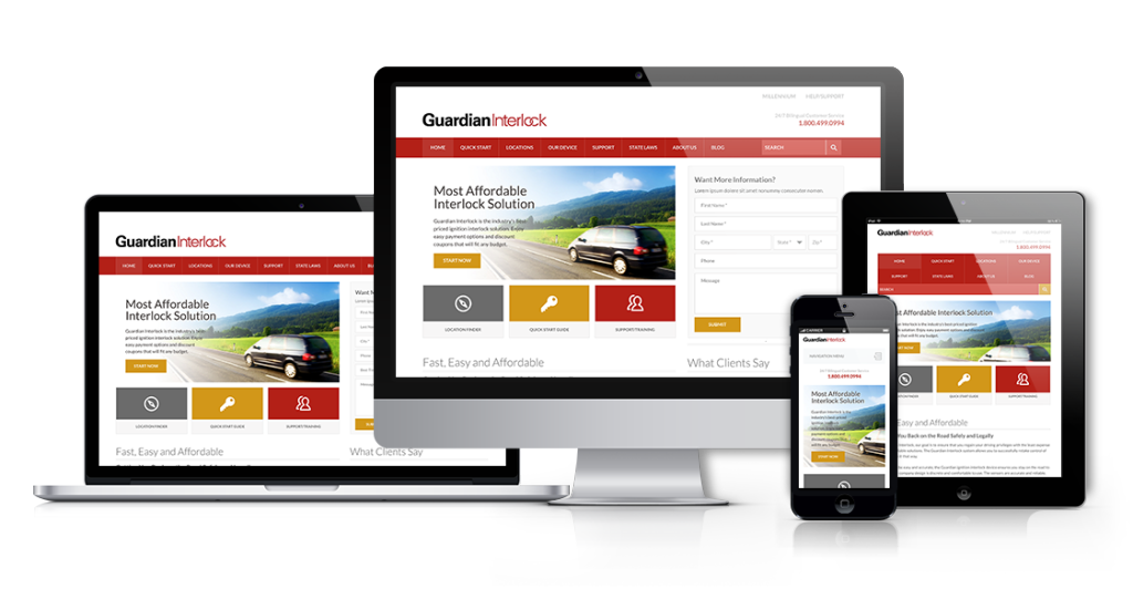
At this point, the client may say “this is perfect, but can we see how it will look on my iPhone? And our new Kindle. How about on my new Tesla S 17-inch vertical screen?” The list goes on. Is it in your contract to design these full-blown Photoshop mock-ups for 3 screen sizes? 7? 10? 84? Where do you stop?
Let's just make a design that works on popular screen sizes. OK, which one? pic.twitter.com/jpJWVeXtES
— Luke Wroblewski (@lukew) June 10, 2014
(Pause for random thought)
We are in this “mobile-first” world so why does everyone present a desktop layout first?
During the next client meeting you present your iPhone, Kindle (tablet and portrait view), and Tesla S vertical screen mock ups. The client reviews the site and decides that the published date should appear after the authors name in each post. Let’s do the math on a typical site:
Homepage
3 featured posts in the hero area
3 popular posts in the sidebar
10 recent posts scrolling down the homepage
Interior Page/Post
1 near the top of this single post layout
3 popular posts in the sidebar
4 related posts under the main content
x 5 screen sizes
120 changes!
I hope you’ve built your main Photoshop document by placing each element/section as a linked smart object with layer comps in your main Photoshop file. If not, you may be in for a world of hurt. What happens if they also want to display the category in which this post belongs? This change would potentially increase the height of the element/post which means the spacing of all elements below would have to be adjusted.
This is crazy. How much time is wasted on some of the unnecessary steps in the design phase when it could be invested in creating a better user experience during development?
We have two options at this point:
- Make 96 edits in Photoshop and fix the vertical spacing while listening to Code Monkey on replay.
- Explain to the client that these types of requests are much faster in the front end development phase.
Often times the client will follow your lead. They may not know what options they have or how much work is really involved in what seems like a minor request. It is our responsibility as designers to communicate and educate our clients about our process. After all, clients are typically in favor of NOT delaying a project for small changes. Just remember to clearly document this request for the client and the dev team to access.
What do we learn from this?
- Setting expectations BEFORE any work begins is incredibly important.
- Our typical (old) design process is broken.
While there isn’t a perfect solution, there area many options available.
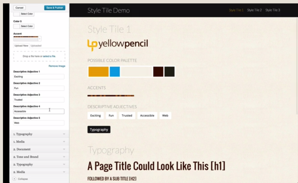
Style Tiles
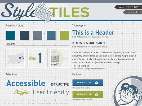
Style Tiles are a design deliverable consisting of fonts, colors and interface elements that communicate the essence of a visual brand for the web. They help form a common visual language between the designers and the stakeholders and provide a catalyst for discussions around the preferences and goals of the client.. – Samantha Warren
The Style Prototype
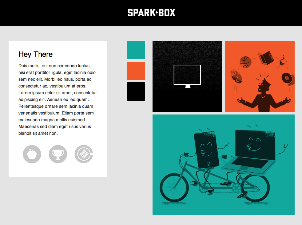
In a nutshell, the goal of a Style Prototype is to allow a client to get a visual summary of a site’s proposed design direction without the time investment of creating multiple pages of Photoshop comps or fully developing HTML pages. A style prototype is a single HTML page which outlines site colors, typography, photographic style, button styles, rollovers, and other necessary elements to establish design direction.

http://seesparkbox.com/foundry/our_new_responsive_design_deliverable_the_style_prototype
Interactive Style Tiles
An in-browser style tile that helps establish a visual language and design direction for your project. It is viewable on any modern device so you can get an idea of how things might feel on your device.

http://www.republicofquality.com/style-tiles/
Atomic Design
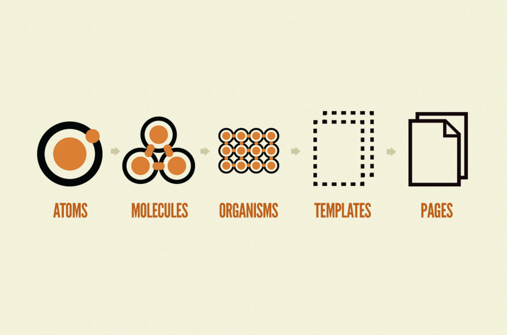
Atomic design is methodology for creating design systems. There are five distinct levels in atomic design:
- Atoms
- Molecules
- Organisms
- Templates
- Pages
http://bradfrostweb.com/blog/post/atomic-web-design/
Element Collages
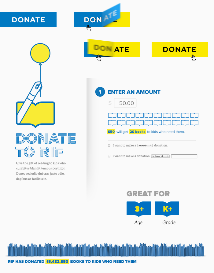
That particular phrase [Element Collage] creates an expectation that what we’re looking at isn’t a final design but rather an assembly of disparate pieces without specific logic or order.
http://danielmall.com/articles/rif-element-collages/
Changing the Focus
The above methods all share a similar approach. They take a step back from creating a full comp and instead, create more granular pieces to start a discussion with the client. It is all about creating a design direction. It is less focused on pixel perfection of an entire layout and more focused on creating a visual language for your project that will be carried out throughout the website.
In addition to the design phase becoming more flexible, this process also lends itself to creating more modular CSS. When viewing a full comp, the designer may have not fully measured out each widget area exactly and perhaps there are some widgets that have 30px of bottom margin while others have 35px. The front end dev (if not the same person who did the design) may be wondering if it was the designer’s intent or if it was an oversight? Using a method such as element collages will definitely take some of the mystery out of this type of variable positioning/spacing between elements.
We challenge you to give this process a try and let us know how it goes. Together, we can move this industry forward.
Solid post. At the end of the day balance is what is needed. By that I mean that we literally may not be able to mock all the screens for every viewport and the client cannot rely on a “don’t worry” it will work out fine let alone the funds to mock everything. They are paying us to work smart and deliver something amazing. Yet, like how hot dogs are made it’s an ugly process. I think a combo of style tiles in combination with greek comps could be a good balance for all stake holders.