The amount of information available on our screens is overwhelming. I say “screens” because we interact with so many throughout the day: smartphones, laptops, desktops, watches, televisions. Even my dentist’s office has a screen in each room that usually plays a screensaver, but is also used to demonstrate my decaying teeth.
What do all these screens have in common? They can display your website if they’re connected to the internet, and chances are it will look different on each and every one. Accounting for all these screen sizes is no small feat and certainly something you need to consider when designing your website.
Responsive Web Design allows us to try and account for, and adapt to varying screen sizes, and is also Google’s recommended method. Furthermore, balancing the use of space in and around content can be a subtle artform, and white space is your friend.
White Space, aka empty space, negative space
One key method for alleviating information overload on your website, and allowing users to easily scan and mentally prioritize elements is white space.
Many people view white space, or “negative space” as wasted space. However, it can be perceived as active space if used wisely, and allows your users to peruse, distinguish, and prioritize chunks of content. White space can help users focus, organize, and emphasize information. White space is part of the invisible interface of web design.
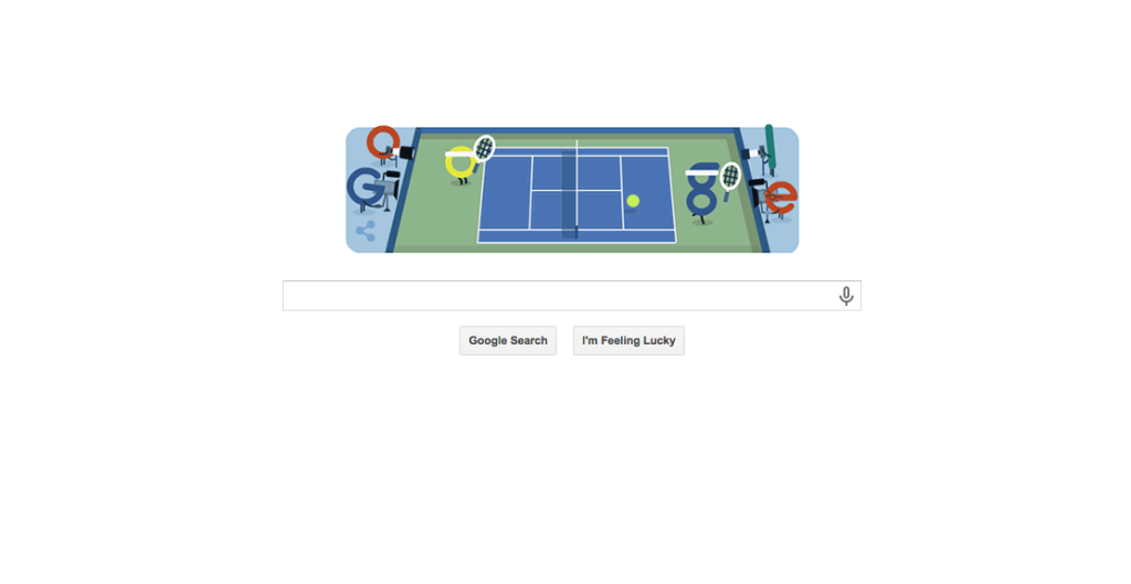
The classic example to observe the clever use of white space is Google.com. There appears to be a vast use of white space, which helps the user focus on the primary goal: search.
What is “Above the Fold” or “Above the Scroll”?
Similarly, an often stipulated specification we hear as designers is the need to keep all the important stuff “above the fold.” Above the fold is one of many print paradigms that people like to try and assign to the web. The screen is not a newspaper, and “above the fold” does not translate well to the multitude of screen-sizes available. However, it can still have meaning. Clarifying a website’s priority of interaction for users can sometimes be relevant to keeping it near the top of the page.
Scrolling is cheap.
“Users don’t want to scroll.” Do not assume you know your user’s habits, needs, or desires. It has been shown through click data evaluation that users do scroll, and if your content is fascinating enough, smartly utilizes (or purposely neglects) whitespace then they’ll keep scrolling.
Closing Thoughts
Ultimately, the design of your website is to tell a story. Identify the KPI (key performance indicators) and design around the content and ideas that get the user’s attention. Data can be a great means for formulating ideas around your users’ needs. Next time you’re in your Google Analytics Dashboard (or Piwik, or other) be sure to check out the section to see your audience’s various screen resolutions. Here is a handy link for a Google Analytics Custom Report template that does it for you: Conversion by Screen Resolution – Desktop & Mobile
Further Reading:
- “Life Below 600px” by Paddy Donnelly
Comments