

We all have to do things in life that we don’t like doing. That’s just how things work. Some unsavory things in life are unable to be avoided or altered and we just have to take them as they come. Luckily, there are still a great number of things in our daily lives that we have, if not partial control, full control over. So when the front-end developers at WDS began talking about upgrades and changes that could be made to wd_s, there was one item at the top of my list: the dreaded hamburger navigation icon.
The conversation first started with the aim of creating an icon that really spoke to us–something that would inspire friends, and Romans, to brave the battlefields of poorly thought-out navigation menus. My initial response pulled no punches and laid out a suggestion as flatly as one could be laid out:
Or, we could totally abandon the hamburger icon like we’ve talked about internally and come up with a different solution for mobile menus since the burger is trash anyway. Just a thought!
coreymcollins commented
I didn’t give much feedback on why, because this is something that we had talked about internally over and over again. As Greg noted in his follow-up, every design comp we produced in 2015 used that icon. This, however, was part of the problem and was indicative of the overall problem with the hamburger navigation icon.
The problem we faced was one of education. Clients and users expect to see those three little lines on a website because that’s just what they’re used to. The icon itself doesn’t outwardly scream, “Hey, bozo! This is a menu!” to a user. It’s just become a thing that is on every website and that does something when pressed. Clients will continue to expect it so long as we continue to include it in our mockups. With that comes a solution: stop including it in mockups.
Let’s maybe backup a little bit here and catch our breath. Why exactly do we want to get rid of this icon, anyway? If it’s become synonymous with “a thing lives behind this button,” then why drop it? Only for the reason that there have been countless tests, studies, and use-case scenarios to prove that the hamburger menu icon is an engagement killer. Even in the last test where the icon was replaced with a button reading “menu,” the user engagement increased by 20%. 20%! That’s a lot of percents! These are no small potatoes, folks. While users may understand that something happens behind that button, they don’t know what happens because the content behind that button is 100% hidden. There is no indication that the content they need is behind it, so pressing the button is really a leap of faith.
Well, lemme tell ya what–I have no more faith in that little icon and I haven’t for quite a while now. With so much information out there to prove to us, and others, that the hamburger icon is a user-engagement and site usage killer, there wasn’t much more to do but decide how we wanted to proceed.
What we eventually boiled it down to is a menu that feels like a native mobile app’s navigation rather than trying to reinvent the wheel or, in this case, the hamburger icon. Most apps place their navigation at the bottom of the window using icons and/or text to let you know what happens when you press said link. Now, I know what you’re thinking: if a client has a mega menu or some such thing with thirty items being displayed at desktop breakpoints, how the heck are we going to cram that into a little baby menu on mobile devices?
The answer is simple: we don’t. Again, this all comes back to education. Not only do we need to educate the client on the best choices for user experience, but we need the client to educate us on their content. We need to know which pages or sections of the site are the most important–it is those pages and sections that should be displayed in our mobile navigation menu.
So, here is our final plan:
- Display the navigation as a horizontal bar at the bottom of the window
- Display up to five top-level items
- If there are more than five top-level items, replace the 5th item with a “more” button
- The “more” button will display the rest of the menu items in an overlay
- Display the navigation menu using the same menu being used as the primary navigation
- Allow for the user to add a mobile-specific menu if their mobile navigation menu should differ greatly from the primary navigation menu
- Provide a graceful fallback for cases when JavaScript is disabled
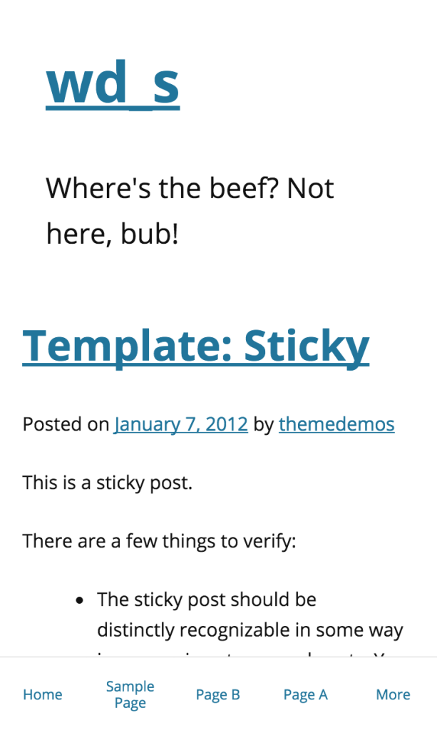
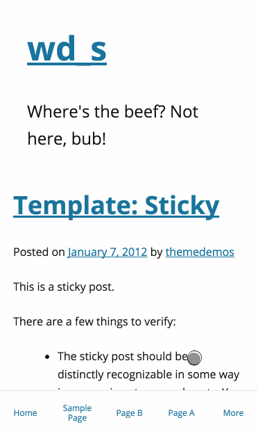
Out of the box, this is how the mobile navigation appears with more than 5 top-level navigation items:

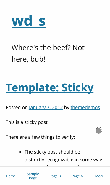
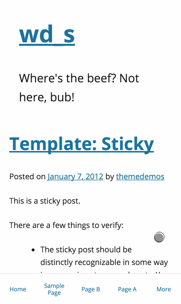
When pressing the “More” button, the navigation slides in using CSS3 animations:

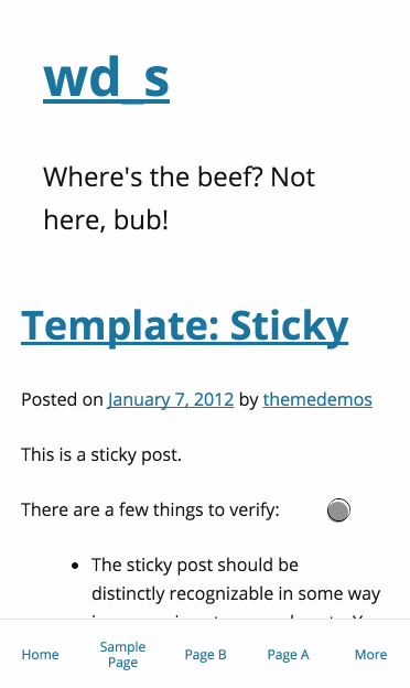
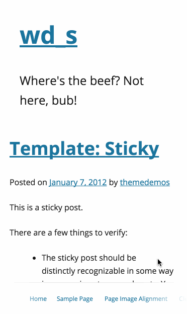
We get the same action when clicking top-level menu items with children:
We need to make sure all of the interactivity is still alive for the parent menu items, though, so we’re also throwing in some JS to allow for parent menu items to be clicked as standard links on a second click:
We’re also able to easily switch between menus without having to close them using the X button each time:
Our last bullet point above talked about a graceful non-JS fallback. Well, here’s what we have so far:
We’ve added some simple gradient overlays to the edges of the menu, as well as some left and right padding to the first and last menu items respectively. This means that the user will see an overlay on top of still-existing menu items that they have yet to scroll to; when the user is at the start of the end of the menu, the extra padding means that our first and last menu items will not be obscured by the overlay.
The menu will always be fixed at the bottom of the window, so as a user scrolls through your site they always have an eye on your navigation. This means that their engagement is being address right at the root–rather than links to your most important pages and sections behind a wall, the user can see them anytime they want. There is no longer a question of how to get from Point A to Point B; all of the thinking is being taken out of the equation for them.
What you’re seeing above is just the out-of-the-box wd_s styles with no spices sprinkled in. You can, of course, style this puppy up to appeal more to your user base:

We think that this is the way to with mobile navigation menus. This solution offers far more user interaction and engagement and does away with a tired old icon that may be hampering your website’s overall potential.
This is still a work-in-progress, but you can follow along with my fork of wd_s. We’ll need to run this sucker through the battery of WDS internal tests and make sure that it makes sense for all use cases, or at least as many use cases as can be imagined, before pushing it out into the world. We’d love to hear your feedback, too! Let us know what you think about the rejuvenation of the mobile navigation menu in wd_s or your thoughts on the transition away from the hamburger icon in general in the comments below.