We all have to do things in life that we don’t like doing. That’s just how things work. Some unsavory things in life are unable to be avoided or altered and we just have to take them as they come. Luckily, there are still a great number of things in our daily lives that we have, if not partial control, full control over. So when the front-end developers at WDS began talking about upgrades and changes that could be made to wd_s, there was one item at the top of my list: the dreaded hamburger navigation icon.
The conversation first started with the aim of creating an icon that really spoke to us–something that would inspire friends, and Romans, to brave the battlefields of poorly thought-out navigation menus. My initial response pulled no punches and laid out a suggestion as flatly as one could be laid out:
Or, we could totally abandon the hamburger icon like we’ve talked about internally and come up with a different solution for mobile menus since the burger is trash anyway. Just a thought!
coreymcollins commented
I didn’t give much feedback on why, because this is something that we had talked about internally over and over again. As Greg noted in his follow-up, every design comp we produced in 2015 used that icon. This, however, was part of the problem and was indicative of the overall problem with the hamburger navigation icon.
The problem we faced was one of education. Clients and users expect to see those three little lines on a website because that’s just what they’re used to. The icon itself doesn’t outwardly scream, “Hey, bozo! This is a menu!” to a user. It’s just become a thing that is on every website and that does something when pressed. Clients will continue to expect it so long as we continue to include it in our mockups. With that comes a solution: stop including it in mockups.
Let’s maybe backup a little bit here and catch our breath. Why exactly do we want to get rid of this icon, anyway? If it’s become synonymous with “a thing lives behind this button,” then why drop it? Only for the reason that there have been countless tests, studies, and use-case scenarios to prove that the hamburger menu icon is an engagement killer. Even in the last test where the icon was replaced with a button reading “menu,” the user engagement increased by 20%. 20%! That’s a lot of percents! These are no small potatoes, folks. While users may understand that something happens behind that button, they don’t know what happens because the content behind that button is 100% hidden. There is no indication that the content they need is behind it, so pressing the button is really a leap of faith.
Well, lemme tell ya what–I have no more faith in that little icon and I haven’t for quite a while now. With so much information out there to prove to us, and others, that the hamburger icon is a user-engagement and site usage killer, there wasn’t much more to do but decide how we wanted to proceed.
What we eventually boiled it down to is a menu that feels like a native mobile app’s navigation rather than trying to reinvent the wheel or, in this case, the hamburger icon. Most apps place their navigation at the bottom of the window using icons and/or text to let you know what happens when you press said link. Now, I know what you’re thinking: if a client has a mega menu or some such thing with thirty items being displayed at desktop breakpoints, how the heck are we going to cram that into a little baby menu on mobile devices?
The answer is simple: we don’t. Again, this all comes back to education. Not only do we need to educate the client on the best choices for user experience, but we need the client to educate us on their content. We need to know which pages or sections of the site are the most important–it is those pages and sections that should be displayed in our mobile navigation menu.
So, here is our final plan:
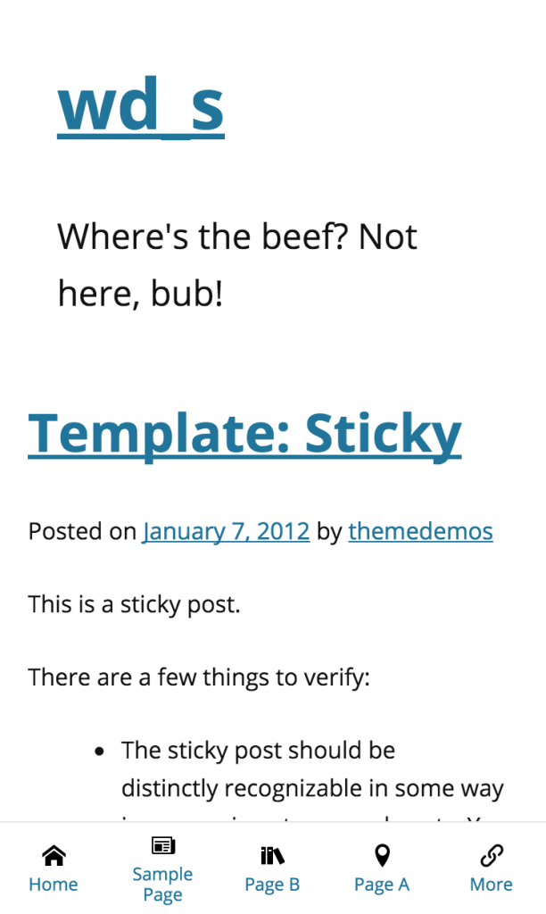
- Display the navigation as a horizontal bar at the bottom of the window
- Display up to five top-level items
- If there are more than five top-level items, replace the 5th item with a “more” button
- The “more” button will display the rest of the menu items in an overlay
- Display the navigation menu using the same menu being used as the primary navigation
- Allow for the user to add a mobile-specific menu if their mobile navigation menu should differ greatly from the primary navigation menu
- Provide a graceful fallback for cases when JavaScript is disabled
Out of the box, this is how the mobile navigation appears with more than 5 top-level navigation items:
When pressing the “More” button, the navigation slides in using CSS3 animations:
We get the same action when clicking top-level menu items with children:
We need to make sure all of the interactivity is still alive for the parent menu items, though, so we’re also throwing in some JS to allow for parent menu items to be clicked as standard links on a second click:
We’re also able to easily switch between menus without having to close them using the X button each time:
Our last bullet point above talked about a graceful non-JS fallback. Well, here’s what we have so far:
We’ve added some simple gradient overlays to the edges of the menu, as well as some left and right padding to the first and last menu items respectively. This means that the user will see an overlay on top of still-existing menu items that they have yet to scroll to; when the user is at the start of the end of the menu, the extra padding means that our first and last menu items will not be obscured by the overlay.
The menu will always be fixed at the bottom of the window, so as a user scrolls through your site they always have an eye on your navigation. This means that their engagement is being address right at the root–rather than links to your most important pages and sections behind a wall, the user can see them anytime they want. There is no longer a question of how to get from Point A to Point B; all of the thinking is being taken out of the equation for them.
What you’re seeing above is just the out-of-the-box wd_s styles with no spices sprinkled in. You can, of course, style this puppy up to appeal more to your user base:
We think that this is the way to with mobile navigation menus. This solution offers far more user interaction and engagement and does away with a tired old icon that may be hampering your website’s overall potential.
This is still a work-in-progress, but you can follow along with my fork of wd_s. We’ll need to run this sucker through the battery of WDS internal tests and make sure that it makes sense for all use cases, or at least as many use cases as can be imagined, before pushing it out into the world. We’d love to hear your feedback, too! Let us know what you think about the rejuvenation of the mobile navigation menu in wd_s or your thoughts on the transition away from the hamburger icon in general in the comments below.
I’ve been vegan for a little over 3 years now, and my web menu choices go hand-in-hand with my food choices. Bye bye burgers!
Love this concept for navigation. Thanks for sharing it with the community 🙂
This is an interesting idea Corey. I have a couple thoughts, those studies you linked to are a couple years old. As the hamburger is used more frequently, it becomes a convention that users get accustomed to, but it didn’t start out that way.
The sub-menu overlay you made is non-conventional, so it seems like you are swapping one unconventional menu for another. I’d be curious to see how that plays out in some a/b testing.
I love that you are thinking outside the box and searching for the best solution. Cheers!
Thanks so much for reading!
Our internal discussions among the WDS Front-End Devs was that, just because something becomes the norm doesn’t necessarily make it good.
Sure, the hamburger menu icon is becoming, or has become, more prevalent in mobile website designs. But, why? Because either A) Designers are tossing the burger in there because it’s expected, or B) Clients/Users have been “trained” to think that this is the way to do a menu on mobile.
We’re not ready to just accept that on our end. Keeping content behind another wall (like the hamburger menu) can be detrimental to the overall experience, and our goal is to make sure the user sees the content that the client views as the most important whenever necessary. This includes using a more app-esque bottom-aligned menu, which can be dressed up to even further mimic an app’s menu by using icons as seen above.
I don’t find the sub-menu overlay to be unconventional; after all, clicking the “More” button in the menu is the same as clicking a hamburger icon – it displays additional menu items. This way, it just has more context.
If you’re referring to the horizontal scrolling menu as being unconventional, then you’re probably right on there – but that’s also a strictly no-JS solution so a user can still access all of the menu items no matter their situation.
Whichever way, though, unconventional doesn’t necessarily mean that it can’t be an alternative or a replacement. Anything other than the burger icon is going to be a tad unconventional at this point, since the burger has become so commonplace (for better or worse).
Our goal is, as you said, to think outside of the box and try to present information in as many ways possible, taking into consideration the needs and desires of content-driven clients and content-seeking users.
Great discussion, guys. I’d also like to add a few articles that cite A/B tests. I think it depends on what is in your menu. If we’re talking about settings, preferences, or other things that are only being used once in a while, or things that a user will specifically go looking for, a hamburger icon and/or off-canvas menu might work fine.
But if the goal is to get people to interact with your menu, stay on your website longer, complete a conversion step, etc. — then these studies elude to using a tabbed/fixed nav bar that stays persistent on the screen.
Also, if you look at some of the most popular apps that are used daily (Facebook, Twitter, Instagram), they all have some form of top and/or bottom navigation icons/buttons. Sure, Facebook also uses the hamburger icon to access more options, but the ones they really want you interacting with are right there on the screen. — So I’m not sure we can call a bottom, tabbed navigation “unconventional” if these popular apps are using it.
And I would argue that the purpose of the menus in wd_s are almost always going to fall in the “get people to interact” category.
Here are the A/B test articles:
http://thenextweb.com/dd/2014/04/08/ux-designers-side-drawer-navigation-costing-half-user-engagement/#gref
http://www.lukew.com/ff/entry.asp?1945
http://exisweb.net/menu-eats-hamburger
I really like the navigation being on the bottom, as long the contrast is high enough to stand out from the content. I’ve seen in user tests where users completely miss the navigation since it’s breaking the top navigation convention.
Now, there is something to be said that app navigation convention (which is typically located at the bottom) is starting to and will continue to bleed over into responsive design, since the context is the same.
I do think the current navigation conventions need to change, especially the larger devices are becoming.
One improvement I can see with a menu like this is changing the location of the close icon for the overlay. What about placing a close button above the navigation, to keep the action close to the menu and easy for users to do with one hand? Now, it is true that their eyes are already up toward the top to look at the navigation links.
Another idea is replacing the active menu item with the “close” text. However, this brings some other issues.
Just looking to generate some more discussion 🙂
Alex — I like your idea of keeping the close icon near the menu (at the bottom). One of my small-screen navigation pet peeves is when the menu icon for slide-out drawers are in the top-right corner, but then the close icon for the drawer moves to the far left. I’m not a fan of making the user move their finger across the screen to simply reverse their previous action (especially as mobile devices get larger, and our fingers & thumbs stay the same length).
Can we say annoying!? Having anything constantly overlaying content has an annoyance level of 20 (scale of 1 to 10).
If it’s so great why haven’t you implemented it?
Everyone is obviously entitled to their own opinion. The reason we haven’t implemented it yet is because we’re putting it through our own internal testing before making it a part of core wd_s. We wouldn’t push something live when it hasn’t been thoroughly tested first. That’s when things begin to break and truly become annoying for all users.
Great insights, Dave!
Alex – since this post went up, we’ve done some tweaking based on some internal feedback and have actually moved the entire menu a decent amount. Rather than sliding in and sitting in the top left corner, the menu items in the overlay now sit in the bottom right corner so they are closer to your thumb (if you’re a righty).
Doing this not only means the user has to move their thumb less, but the close button will always sit directly above the menu items.
Any pattern can be annoying if implemented poorly. Facebook, Instagram, Twitter, and most every major app these days is using a similar “always present” navigation pattern to great effect on their mobile sites/apps.
This is interesting stuff and I appreciate the post. But with all this talk of usability, I want to point out that the extremely-light-grey color of your body text is very hard to read. I would have read the whole article, but it was just too much eyestrain..
Thanks for the feedback! We can definitely look into that and see what adjustments may need to be made on our end.
I’m trying to implement this on a plain-vanilla install of WordPress using the Twenty Sixteen theme, as proof of concept. The -1 z-index on .mobile-nav-menu.more .mobile-nav-menu-hidden seems to prevent clicking on the last one or 2 items when a “more” menu is displayed. Moving the via e.g., top:5rem seems to fix it, as does changing the z-index to a higher number (but that breaks some other stuff). I’m trying to understand what might be causing this behavior. Any thoughts?
It’s currently a local install, but I could put it on a live server if you need to see it in action.
“Moving the via e.g., top:5rem seems to fix it,” SHOULD read “Moving the unordered list via (e.g.,) top:5rem seems to fix it,”
Having not got a response for the z-index problem above, I was able to fix it by raising the z-index on `.menu.dropdown.mobile-nav .visible > .sub-menu` to 1. You’ll have to raise the z-index on the close button to 2 if you implement this.
But I’ve discovered a second issue: any sub-menu item with children does not have the expected behavior. Instead, clicking closes the overlay. I’ve traced it to this bit of JavaScript:
` that.removeMenuClasses = function() {
// Remove any instances of classes already in place
// This makes sure we can click to switch between submenus
$( ‘body’ ).removeClass( ‘mobile-menu-more sub-menu-more’ );
that.$c.mobileNavMenuContainer.removeClass( ‘more’ );
$( ‘.menu-item-has-children’ ).removeClass( ‘visible’ );
}`
When you click a link with children as noted above, the “visible” class toggles and the menu closes.
Thank you for the great article & for making the fork of wd_s available. I downloaded the code from Github & modified it for my site. If you’d like to see it “in the wild”, it’s at https://mercury.photo. Suggestions for improvement welcome.