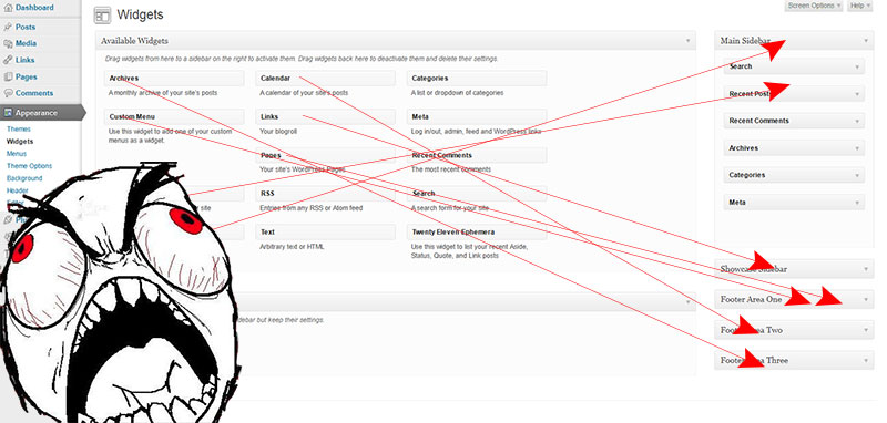
Let’s face it – unless you like devoting your time to clicking, dragging, accidentally letting go of your mouse button, then clicking and dragging again, we all hate the widget management page. With things becoming more and more streamlined with each WordPress release, how is it that the widget page remains such a cumbersome, laborious trial of will and patience (not to mention finger dexterity)? I’m sure we’ve all complained about it at one point or another, especially when a client wants a bevy of widget areas/sidebars forcing you to try and make your browser scroll while dragging a widget to the bottom of your list.

We’ve all complained, sure. And thanks to inspiration garnered from the WordCamp San Francisco contributor day, we’re now going to do something about it!
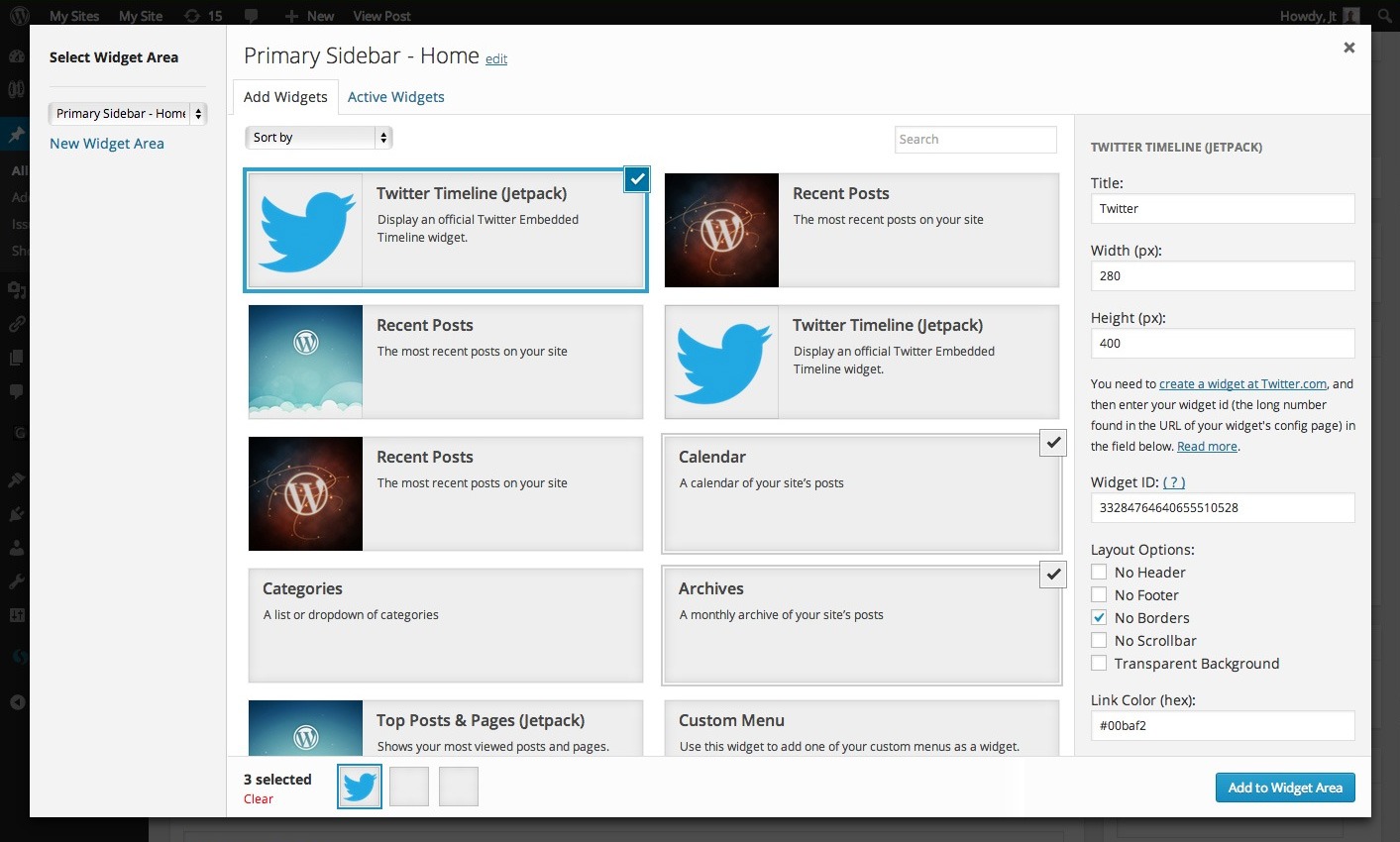
The idea started simply enough – an easier way to add and configure widgets. Rather than using the drag-and-drop method currently in place, we wanted a straightforward and streamlined approach. The widget area would hold an “add a new widget” button that upon clicking, would present a modal window in the same style as the media manager.

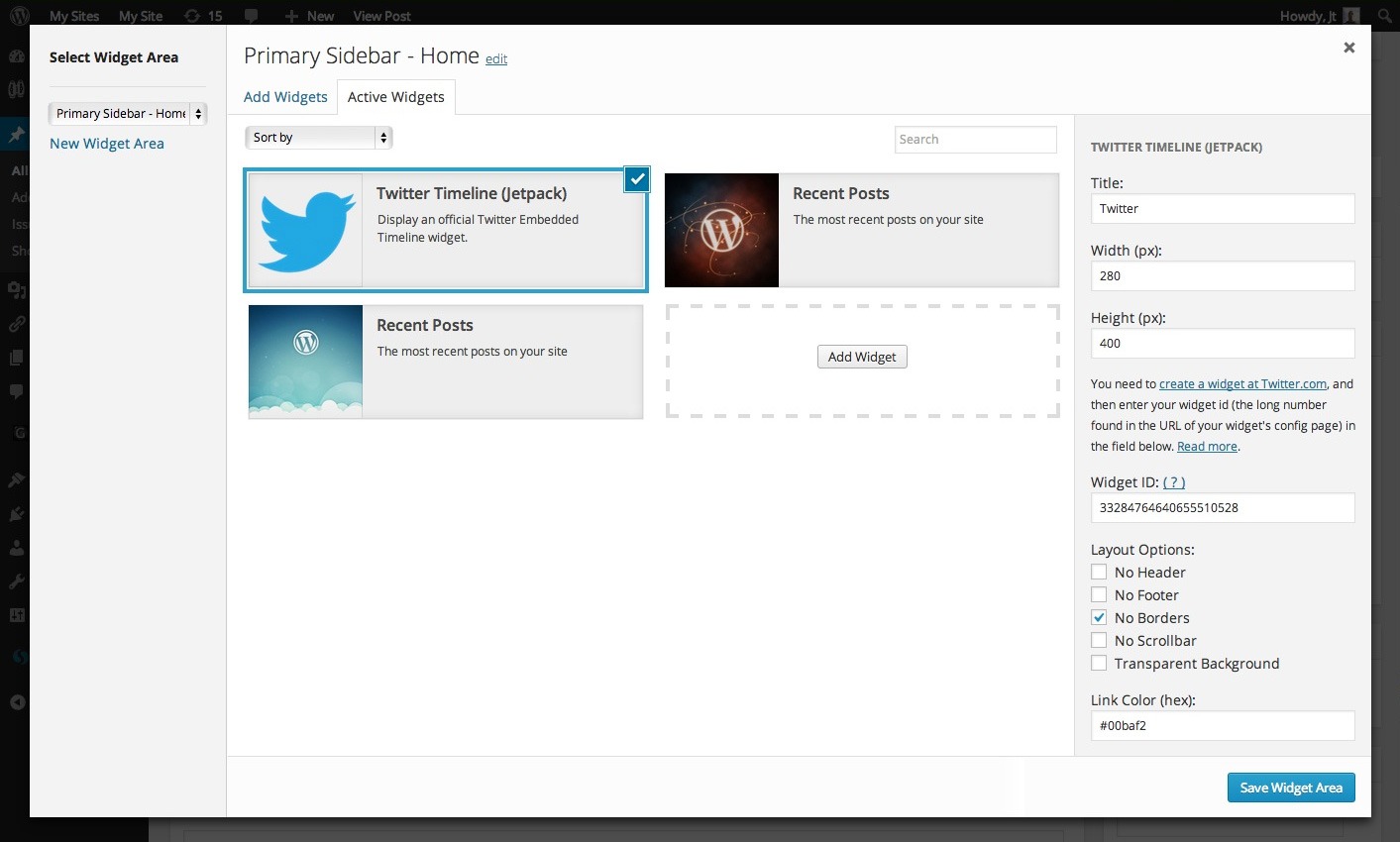
All available WordPress widgets are listed here. Think of the media modal’s grid presentation of media. When you click on a widget, its fields are presented on the right side of the modal window (in place of the attachment details). Want to add multiple widgets to a widget area at once? Just control/command click or drag to select multiple widgets, then click the “Add to Widget Area” button in the bottom right hand corner.
Could it be any easier? A way to not only do away with the endless struggle of dragging widgets all over the page, but also to edit and add multiple widgets at the same time. Streamlined.
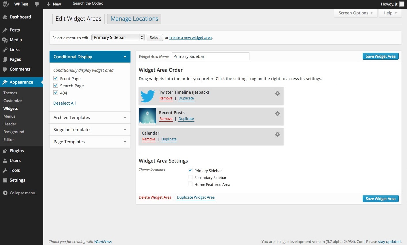
But why stop there? After all, if we’re not going to have the widgets on the left side of the widget management page, then we’re going to need to do a bit of a redesign. We’re not looking to reinvent the wheel here, but rather piggyback off of another existing area in WordPress the same way we are with the new widget management modal. In this instance, we’re adopting the same layout as the menu management page.

Instead of displaying every widget area on a page, we’re going to give importance to the widget area you’re editing right now. Select a widget area from the dropdown menu and voilà – you’re looking at your existing widgets and are able to rearrange, remove, and add new widgets quickly and easily. Click the cog to quickly pull up the widget settings:

But what is a widget area? As it is now, widget areas are synonymous with registered sidebars, and a registered sidebar is synonymous with a location in the theme. The plan is to abstract widget areas, newly defined as a container for a configuration of widgets, away from the theme locations. This way you can register a sidebar (a holder of widget-areas) in your theme, specify it’s location(s) in the theme (where that holder of widget-areas should be displayed) and the magical part, from within the WordPress admin choose which widget area that sidebar should display. This opens up a whole slew of opportunities for conditional widget area placement.
(One small caveat that we would like to take note of here is that widget areas will automatically be created and applied to each sidebar registered in the theme. This should help save a step that’s currently required with menus if all you want to do is have one widget area per registered sidebar.)
We’re all familiar with the menu management page, so we know that we would need to retool the left hand column to make sense in our widget management page. Posts, Pages, Categories and Taxonomies become a more powerful conditional display options section for your widget area. Right from the WordPress widget management page, you can decide to place your widget area in a specific page template; to display it for specific users; to display it on specific posts, categories and taxonomies; and to override the default widget area used in an existing template. Our hope is that everything that you can accomplish by editing a template file will be able to be accomplished right here in the dashboard.
This is all fine and dandy so far, but we’re still not done. Have you ever had the experience of adding a widget to a widget area, only to realize that you need to add the same widget to many other widget areas? What if you want to duplicate an entire widget area without going through and adding and re-configuring every widget again?
We’ve got a solution for that with “Duplicate” buttons. The widget duplicate button will copy a single widget to another widget area with a couple clicks, saving you the trouble of dragging, dropping, and possibly editing another instance of the same widget all over again. The widget area duplicate button creates an exact duplicate of the current widget area, so you can simply modify the widget settings that you need.
This is a pretty ambitious project but we’re confident that WebDevStudios can spearhead the production of this project and we would love to get your help! In keeping with the new philosophy of WordPress development contributions that Matt Mullenweg highlighted in his State of the Word talk at WordCamp 2013 (go see it if you haven’t!), we plan on working on this as a separate plugin. We have it available as a public repo on our GitHub page and we’re hosting the discussion over on the WDS Core Development site. Let us know your thoughts in the comments. We’d love to have you partner with us in our goal of getting this included in core by WordPress 3.8, tentatively due in December of this year.
This is tremendous.
Hell yes. Good on you.
Love it! Definitely a huge improvement from the current version.
Hey guys,
I am so ecstatic to read that you’re planning the widget area overhaul. Widgets have been the primary target of my WP Admin scrutiny. I’d love to find a way to make a contribution. I’ll check out the chat area and the git repo for details.
Thanks!
I love the idea. Yes, the current widget UI sucks, especially when we need to drag the widget all the way down somewhere at the bottom.
Hope to see something better in WP 3.7 or 3.8.
This looks heaven sent, very exciting. The current Widget UI is my biggest gripe with the WordPress interface and this overcomes almost all of the limitations. Will be watching this very closely!
This looks sweet. There are so many plugins out there that make an attempt at making widget management easier, but this is the best I’ve seen. Looks AWESOME.
Looks very promising. Widget UI needs something like this!
Great initiative!
I’d keep that goal of 3.8 very tentative. I’d have thought something like this was better off left simmering with a lot of testing before launch, so I wouldn’t hurry too much before launching. But then perhaps it will be awesome from the get go 🙂
Simply… Awesome!
BOOM! Love this creative thinking to an old function / design that is in desperate need of a make over. Keep up the good work WDS and thanks for sharing your idea early in the process!
Cool!
Would also be nice to add some logic to it. Wether to show a widget on selected categories / tax. Or show on all pages except for selected pages.
Very nice!
I regards to templates and widgets. I have been thinking of ways to incorporate templates into the new/edit screen for a page/post and also category. Drag and drop layout system with a semi transparent grid (improved table) create the page and save. Save as a template as well. One can easily create a new page by using an existing custom template and the layout area will reflect the template design. Make changes and save.
http://easywebdesigntutorials.com/wordpress/wordpress-mockups/
Nice! It should be in core!
I would love to see some sort of “Context Widget” functionality added. I often find that I don’t want every widget on every page, so I can organize which widgets go where with a plugin like this.
Having this baked into core would be awesome.
Very cool idea guys! Looking forward to seeing it gain some traction!
Yes! User-defined “widget areas”, that get applied to Theme-defined dynamic sidebars (i.e. “widget locations”)! I believe that is the correct approach. (And users having to re-group the same sets of widgets ad nauseum every time they switch to a new Theme will be a thing of the past: simply assign a “widget area” to a dynamic sidebar and be done – just like with Menus.)
But, if I’m understanding this correctly, I don’t think I like it:
This will break the
is_active_sidebar()and/or! dynamic_sidebar()conditional handling within the template. There’s no need to take this step, sincedynamic_sidebar()already degrades gracefully if the specified sidebar is not active.To clarify, the widget areas would be created/assigned, but no widgets. The conditionals you mentioned would still operate based on whether widgets exist in the sidebar, not whether a widget-area is assigned.
But would it really need to do that? If you made it a bit more analogous to custom nav menus, such that user-created “widget areas” (“custom nav menus”) are entirely independent of “dynamic sidebars” (“menu theme locations”), wouldn’t that simplify things, and make it easier for users to create custom widget areas once, and then use them in any Theme?
Fabulous! The widget area is due for a complete make over and I like what I see here 🙂
Would be great if you could Bake-In some “WYSIWYG” Functionality as well as “Widget Logic” too, then I could get rid of (2) Plugins too.
Don’t stop with just widgets, I think the menu manager needs similar attention. The menu manager needs to expand and collapse hierarchy to make it easier to work with. I find I spend far more time managing menus than I do widgets.
Mike,
Check out the Menu Management Enhancer plugin. It’s pretty sweet.
http://codecanyon.net/item/menu-management-enhancer-for-wordpress/529353
Gorgeous! I like 2 things most:
– Each widget is wider than before with icons, images, etc. It increase UX a lot as we easily can find the one we need. No need to read text anymore.
– Popup to select widget. I think popup gives us more space to show widgets than a sidebar. When number of widgets increased, a popup can have filters, pagination, etc. which helps us a lot to organize widgets.
But I still don’t like the main screen, somehow it’s not too easy to use (for me).
This is awesome! I’m glad to be reading that webdevstudios is going to be spear heading this one.
This seems to lends itself to a 3 column layout where each column is informed by the column to it’s left. The column could then become slide in/out panels on mobile some day.
Widgets               | Widget Areas          | Sidebars

----------------------------------------------------------------

Text          (add) > | Area 1        (add) > | Primary Sidebar

SideBar Login (add) > |   Text 1              |   *Area 1*

Form          (add) > |   Text 2              |    Area 2

              (add) > |   Form                |
That’s probably an awful explanation… but hopefully you’ve seen this sort of UX before and have at least a rough idea. I’ll try to mock up the idea in html or balsmiq and git involved on GH
and trac.
+1
Wowie! The current widget template is awefull. This is very welcome! Thanks for the reference to the menu Enhancer btw 🙂
Cant wait to see what you put out there guys.
This is a really interesting project, this is a area of WordPress which I’ve felt has let it self down against other CMS’s such as Drupal. Using Drupal you have so much more control other what widgets appear on what pages and add additional widgets on certain pages.
I would really like to see this done in WordPress. Whoever is developing this project, let me know if you need any help as I would love to get involved.
Hey Paul
Check here for the latest WordPress Widget info:
http://make.wordpress.org/ui/2013/08/28/widgets-widgets-widgets-meeting-aug-26-2013/
Have a great day!
This is a very nice feature if it’s added into WordPress core. The current widget area makes my clients, who has no idea about using WordPress, hard to find quickly what they want. So this improvement is really useful.
I like the ideas presented here for reworking the widgets area. The existing drag and drop interface is hopeless when a theme has many widget areas and this seems to help with that. I think it would also be a lot easier to make it fully accessible to screen readers and voice recognition software – something that’s vital to improve the accessibility of the WordPress admin area going forward.
Nice one.
Make it happen! Yes… Always keep open to the feedback you receive (here, and elsewhere), and you will nail it.
Can’t wait…
It’s really annoying when you want to put same widget in different widget area.
This featured will solve it.