There is no shortage of information about style guides. In fact, while I was writing this post I saw a tweet from Brad Frost announcing the launch of styleguides.io which he described as
“an open-source website for sharing resources about style guides: articles, books, talks, podcasts, tools, and examples”.
I have been working with several style guide theories or libraries lately and wanted to share my thoughts.
Why create a style guide?
- Helps to keep the code consistent
- Sets a standard for the vocabulary used in a project (between the team and clients)
- Keeps code more modular (or at least, lends itself to getting in that mindset)
- So much easier to test
- Helps bridge communication between the designer and the developers throughout the project especially when a PSD mockup is not present for every layout you will ever build for every screen size.
How does this help with testing?
We are working on a site that has nine configuration options for the hero module. Only one hero template is displayed at a time on the website, but in our style guide we can make sure to display all of these on one page which is a HUGE time saver. You no longer have to edit the page, select the hero options, save, view page, repeat 8 times, make another change, repeat the cycle, cry.
Won’t this add another step in my design and development workflow?
Well, kinda. But with a little set up in the beginning, you will end up saving time for the duration of the project, especially in a QA phase.
Aren’t style guides impossible to keep maintained after a project launches?
While it isn’t quite as easy as just updating the buggy code or creating the new feature itself, it also doesn’t have to take away too much time. Think of it as writing documentation for that new feature which you should be doing anyway, right?
The key is to create a Living Style Guide, meaning not something that is just generated once, but something that actually lives in your existing stylesheets and gets compiled automatically. The only additional work you have to do is add the markup that you want shown on the style guide page for each element.
I’ll admit, I was scared
Back in July I gave a presentation at WordCamp Milwaukee about how our design process is evolving. I touched on the importance of style guides but ended that segment talking about how implementing a style guide generator was difficult and that maybe someone more “developery” than me would have to set it up. I realize now that I sounded like a snippet from the book “Barbie: I Can Be A Computer Engineer“.
The most difficult step for me was getting the style guide installed and configured, but in the scheme of things it only took me an hour to get it exactly how I wanted.
Creating a Style Guide with Hologram
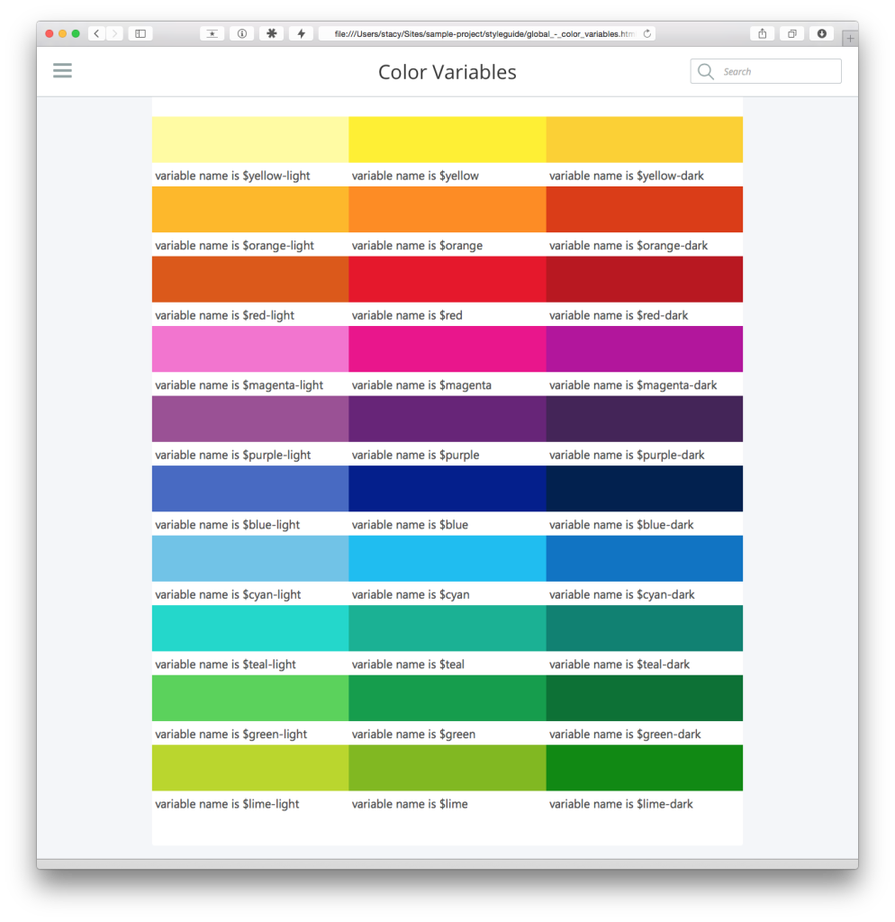
I really like Hologram as I found it fit best into my workflow. Hologram will look for code blocks in Markdown within your stylesheets (I typically add them to my SCSS partials) files and will create an html page for that block based on the title you give it.
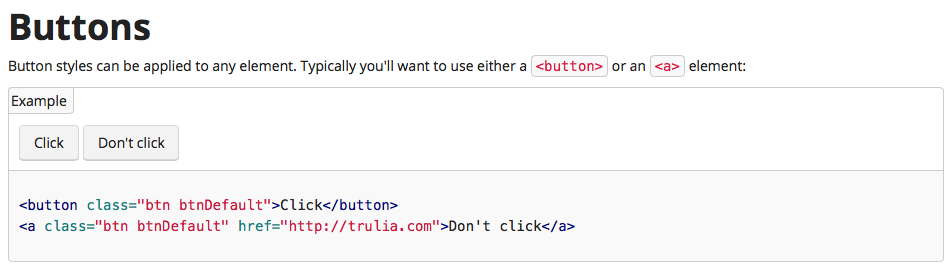
Here is the example they use.:
/*doc
---
title: Buttons
name: button
category: Base CSS
---

```html_example_table
<button class="btn btnDefault">Click</button>

<a class="btn btnDefault" href="trulia.com">Trulia!</a>
```

*/
The code inside the html_example block will be rendered visually as well as displayed as code for easy copy/pasting. The additional information is helpful documentation that is important for your projects consistency and development.
How to Install Hologram
Hologram is a Ruby Gem so install it with the following commands in your command line program of choice:
gem install hologramNote: I also need to add sudo before this command because I really only pretend to know what I am doing in the terminal and I feel like this isn’t documented nearly enough. If you are like me you may need to type:
sudo gem install hologramIf you have to use the sudo command it will ask you for your use password. Your password will not be displayed as you type so just rest assured it is capturing what you type. Hit enter after typing your password.
Once hologram is installed you will want to cd (change directory) into your project folder:
cd /Users/stacy/Sites/sample-projectnow type
hologram initand it will create the files you need to make the most basic version of your style guide. Chances are you will want to edit your hologram config.yml file to set up the source and destination folders for your project and style guide files.
To generate your style guide, type
hologramHopefully you receive a success message (if not, at least the error messages are typically helpful).
Hologram doesn’t come with a styled version of itself, so you can certainly use your projects stylesheet (may have to make some edits), create a custom one you can use for all of your projects, or check out Cortana.
Including style guide generation into our workflow
We use Grunt for our projects at WebDevStudios so it seemed to make the most sense to include Hologram into our grunt workflow. You can view the full grunt-hologram plugin installation details on github but here are the basics:
Assuming you are a grunt user, you can run:
npm install grunt-hologram --save-devAdd the following to your Gruntfile.js somewhere inside the grunt.initConfig brackets:
hologram: {
	generate: {
		options: {
			config: ‘./pathtofile/hologram_config.yml'
		}

	}

},
Add this line where you are loading your other NPM tasks:
grunt.loadNpmTasks('grunt-hologram');Finally add ‘hologram’ to one of your registered grunt tasks which will generate an updated version of your style guide as you make changes.
Additional Resources
While styleguides.io has pretty much anything you’ll ever need, here are a few of my favorites:
Great post, thanks for sharing!