You’ve pushed your final bit of code and crossed the final item off of your to-do list. Now it’s just time to sit back, relax and wait for all of the praise on a job well done to come rolling in, right?
Wrong.
WRONG WRONG WRONG.
Just because you think you’re done with a site doesn’t mean that you’re actually done with the site. I’m pretty sure Confucius said that. And what that means, basically, is that once you’ve pushed your “final” code and crossed off that final to-do there are still one million things left for you to do. Yes, you think everything looks good in whatever browser you’ve been working in, but have you considered other browsers and their thoughts? Their feelings? The way they handle your pseudo elements, or the way they display an SVG font as a craggly mess? You didn’t think about that, did you?
GOD, YOU’RE SO INSENSITIVE!
But we can help with that insensitivity. That lack of a second-thought you give to the way your favorite browser works on another operating system, and the way your least-favorite browser mangles all of the delicate beauty you’ve painfully crafted over the last six weeks.
Around these parts, it used to be that I would complete a site and proudly watch as it entered the QA process. I would smile along with any other designers with whom I had worked on the project, a little smug in our belief that the entire QA process would be totally fruitless for the QA’er. How could they find anything wrong with something so wonderful? We’ve made their job so easy! Soon, there wouldn’t even be a need for a QA’er to QA anything what with all of the certified gold we were churning out.
Let me like myself sometimes
Let me be narcissistic sometimes
I’m not like this all the time– Everyone Everywhere, “I Feel Fine by Everyone Everywhere“
It is in those moments where I now realize how gravely I overestimated our aforementioned gold and how deeply I underestimated the QA prowess of one Lisa Sabin-Wilson. You don’t know true shame until you’ve passed off a site for QA and see it come back with three dozen new to-dos. Well, until you look at the to-dos and realize how easily these QA issues could have been fixed. You can tell yourself whatever you need to tell yourself to try and feel better about it – you’ve been looking at it for so long that it’s easy to miss the little things. Right? That’s a real thing, right? What it comes down to, though, is that you’ve overlooked some pretty obvious and easy things and being called out on those via the QA process is like a punch to the head, heart and ego.
I want to smash things
I want a coffee
I want to punch myself repeatedly– Everyone Everywhere, “I Feel Exhausted“
It didn’t take long for me to realize that I needed to change the way I was doing things so the resulting product would have a much easier and simpler QA process once it left my hands. Damn it, I’d QA the site myself before I even handed it off to someone else! As a Front-End Lead at WebDevStudios, that came as part of the job so my rallying cry to myself is more of a way to pump myself up than me shaking the foundation of QA itself. But hey, if you can’t be proud of the work you’re doing and get yourself excited to do it, then what’s the point of doing anything? Why even get out of bed? Why even wake up, ya damn bum?
So, what’s the big secret? How do I QA sites before I pass them off for a final review, ensuring that all of the little things have been sewn up?
Spreadsheets.
Yep. Spreadsheets.
I didn’t know what would be the best way to organize my QA thoughts. I broke out a pen and paper and scrawled chicken scratch into shoddy columns, making notes of which browser rendered something too weird to accept. Even then, though, you can miss things because you’re still working against your own brain and memory. Work-as-you-go QA still allows for things to be left behind.
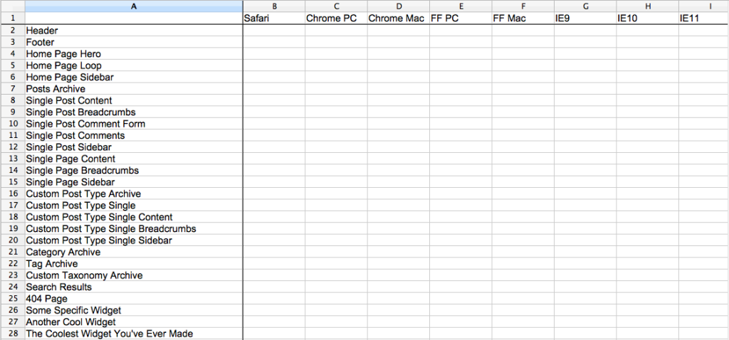
My first step in the QA process is to visit the WordPress dashboard. I look at the sidebar and begin making a list of all of the various post types. Posts and Pages, of course, but then any other custom post types that may have been registered. We’re not just listing the post types, though – we want to be as granular as possible. Post archives, single posts, post type-specific sidebars, etc.
What about taxonomies? Categories, tags, custom taxonomies – you’re going to want to make sure you’re looking at those, too. Sure, maybe you’re using a single archive template file to power all of your archive pages, but don’t be so sure that something weird won’t crop up on a custom taxonomy page just because your category archive page looks terrific. Expect the unexpected, and then go fix it.
And for the love of God, don’t forget the search results or 404 pages.
When all is said and done, I wind up with something like this:
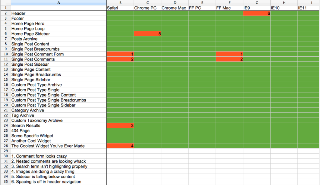
While I walk through the QA process, browser-by-browser, I eventually wind up with something like this:
It’s the most wonderful time of the year, isn’t it?
As you can see, I block cells out with green if they’re good to go and red if they’re bad to go. In addition to the red menace, I’ll add a number with a corresponding note that falls below. This way, I can organize my thoughts and add individual, granular tasks into Basecamp so I can help track the process a bit more. Plus, rather than fixing everything immediately as I see it, this allows me to see if there are any trends across browsers (this is why you see numbers repeating across columns). If something is breaking in all but one or two browsers, then maybe it’s something I’m doing wrong and not something the browsers are doing wrong.
Since implementing this method for myself, I really feel that the quality of my QA’ing has increased exponentially. Now, instead of just running through the site and telling myself I’ve checked off all of the possible pages, page templates, post type archives, etc., I can sit confidently knowing that – yes, I DID check that post type out or no, I did NOT remember to check a specific page template. At this point, I’ll add it to my spreadsheet and start the process on that single item once again. Maybe you’re telling yourself that, in the final stages of QA, you’d rather just check the items you may have forgotten without opening up the spreadsheet again. But what’s the point of that? If you’re writing everything down and making notes of everything you’re seeing, you can rest assured that you have absolutely, positively, 100% checked everything that you had needed to check.
I’m not saying that this is the best way or the only way to QA. Everyone works differently and what works best for one person may not work as well for the next. For me, though, being able to block out each portion of the site and make a visual mark of the work I’ve done QA’ing it has been hugely beneficial.


I like it!
We also use a spreadsheet (Google Sheets to be exact, is that what you were using??) to log all our QA issues, but hadn’t thought of the color coding for the different browsers… love it!
Will pass this on to my team!
Patrick
I’m using Office, but really any way you can make a spreadsheet to piece out these items is doing to work. Whatever floats your boat!
Glad I was able to add something to your process with the color coding.