What is Lean UX?
Lean UX was born out of the Lean startup movement. The concept of ‘being lean’ is derived from Lean manufacturing principles, which essentially postulates [1]:
“making obvious what adds value by reducing everything else.”
Lean UX !== Agile UX
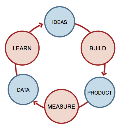
Lean UX can sometimes be confused with Agile UX, which is an earlier manifestation. While Agile UX relies on the integration of User Experience Design into Agile Software Development Methodologies; whereas, Lean UX is suited to the Build-Measure-Learn cycles, or learning loops.
As Jeff Gothelf says [2]:
“Lean UX is an evolution, not a revolution.”
What does Lean UX have to do with design?
One beneficial model for incorporating Lean UX into the design process is leveraging Style Tiles, or element collages. Traditionally, client work relies heavily on creating elaborate Photoshop mockups. However, this is precarious because designing a page is quite different from designing a block, or widget, section, element, what-have-you–as is monitoring and eliciting feedback, and developing such elements.
This whole process relies heavily on assumptions on the consumer’s desired values, and can generate the waste that bogs down budgets (time, money). As my colleague Corey Collins so poignantly points out [3]:
“We’re seeing everything for what it is: a single piece of the puzzle rather than looking at the entire puzzle and trying to pick out the pieces we feel hold the most importance.”
Why not focus on creating smaller artifacts (Build), which allow for quicker feedback and testing? Evaluate your user’s reaction (Measure), compare to the designed postulate, and improve (Learn). Build-Measure-Learn, and cut out the waste.
Footnotes:
- “Lean Manufacturing” – Wikipedia.org
- “Lean UX: Getting Out Of The Deliverables Business” – Jeff Gothelf [SmashingMagazine.com]
- “Getting Small with Modular Design as QA” – Corey Collins (@CoreyMCollins)
Comments