The quest for a beautiful, responsive website is ever-present. As front-end developers, we know the tricks of the trade when it comes to making all of those fancy little features work from desktop to mobile. Whether it’s degrading hover-based actions gracefully or just making sure everything falls where it should, part of our job is to always make sure the mobile user experience accurately reflects the desktop user experience.
It isn’t all just stylesheets and sunshine these days, though. We need to focus on way more than just making sure a site looks good on mobile. We also need to make sure a site works as efficiently as possible. There are several ways we can achieve a more efficient mobile experience from only loading the scripts we need at specific breakpoints; only loading the site elements we need at specific breakpoints; and finally, the focus of this post, using and displaying proper image sizes at the various breakpoints we set for our site.
What exactly does that mean? Well, let’s say you’ve got a hero image at the top of every single post page. You want the image to span the entire width of the browser so you add an image size of 1680px by 400px. This works great for a big desktop display — even if the resolution is set wider than 1680, we can do some easy CSS manipulation to crop and position the image so it always displays nicely. What happens when we start moving in the other direction though?
We obviously don’t need a 1680px wide image to be displayed on a mobile device. The iPhone 6 has a screen size of just 375px by 627px, but even multiplying by two in order to get the retina-display pixel output, a 400px tall image is going to take up a lot of space. We could just resize the image container with CSS and use overflow: hidden to adjust the display of the image. This would give a very crisp and high-quality image at smaller screens but it’s going to come at a price: data usage and load times.
If we’ve got a page full of high-quality and desktop-sized images and we’re loading each of them on a mobile device every time the page loads, we’re going to be killing our user’s patience as well as contributing to killing the user’s data allotment. The page (and site) is going to take much longer to load which will likely result in less user engagement over time. This means less people visiting the site due to a poor experience they had in the past.
By this point you may be thinking, “Hey, ya dumb donkey–there are already plugins doing this exact thing!” to which I would say, “Hey! No need to be rude! And also, let me explain further.”
 I know RICG Responsive Images is out there and is something that has recently been worked into WordPress core. Using the RICG Responsive Images plugin, though, is what drove me to come up with my own solution.
I’m not saying RICG Responsive Images is wrong or bad; it’s very clearly neither. However, I was finding that it wasn’t fitting the need that I was looking for. In my usage and testing of RICG, I was finding that it would display the images at descending breakpoints in a very logical way: it would use whatever image is requested at the largest breakpoint then use smaller images as we size our browser down. I also found the setup of the settings to be a bit confusing. I’m not a new dev by any means and I’ve been a part of some very cool, unique, and complex functionality built here at WDS. Something about RICG just didn’t click for me in the setup which was another source of frustration.
To hit on the first issue: RICG seemed to only size images down, which is a pretty logical execution of responsive image replacement. However, that’s not always what’s needed. For instance, you could have a case of using a 150px by 150px image at desktop, but at mobile you want that image to expand the full-width of the device screen. I was unable to find a way to accomplish this with the RICG settings.
On the issue of actual implementation, I wanted to make it as easy as possible to replace images at various breakpoints. Rather than having to adjust the way we output images, we’re just adding a layer of jQuery on top of our current functionality to do all of the heavy lifting for us.
So, let’s get into it shall we?
The first step, of course, would be to install and activate the plugin which can be found on my GitHub page here. The plugin is currently called WordPress Responsive Images because I couldn’t think of a super cool pun or play-on-words, plus the current title does a pretty good job of summing up the plugin’s purpose.
The second step is the actual implementation of the plugin. At this point, we’ll assume you’ve already registered some image sizes to be used throughout your theme. We’re just going to tie into those already-existing image sizes to do our funky magic. How exactly do we tie into those image sizes? Let me break it down for you!
This plugin utilizes the built-in classes applied to images by WordPress. For instance, if you are displaying an image at thumbnail size, WordPress adds a class of “attachment-thumbnail” to the image. If you create a custom image size called “single-post-hero,” WordPress would add a class of “attachment-single-post-hero” to the image.
The first thing WordPress Responsive Images does is adds data attributes to the images used throughout your site. The data attributes follow the format of data-image-size-name. So, using the previous example some of the data attributes for an image used in your site would be:
- data-img-size-full (WordPress default)
- data-img-size-large (WordPress default)
- data-img-size-medium (WordPress default)
- data-img-size-thumbnail (WordPress default)
- data-img-size-single-post-hero (your custom image size)
Data attributes need values, though, right? Right! So what we’re doing next is finding the URL for the image matching each image size present in your site. We wind up with image markup like this:
<img src="/wp-content/uploads/2015/09/house.jpg" class="attachment-single-post-hero" alt="house" data-img-size-thumbnail="/wp-content/uploads/2015/09/house-150x150.jpg" data-img-full-size="/wp-content/uploads/2015/09/house.jpg" data-img-size-medium="/wp-content/uploads/2015/09/house-300x169.jpg" data-img-size-large="/wp-content/uploads/2015/09/house-1024x576.jpg" data-img-size-single-post-hero="/wp-content/uploads/2015/09/house-1680x400.jpg" data-img-size-full="/wp-content/uploads/2015/09/house.jpg">

By default, you won’t need to register any breakpoint sizes. Included in the plugin is a simple CSS file which adds a pseudo element before the body tag which we can then access in a JavaScript file. This awesome article by Mike Herchel demonstrates how to display a breakpoint as content before the body tag so we can perform specific JS functions at the exact time we need them. I won’t go into the specifics of how this works or how to utilize the breakpoints as Mike goes into it in depth in the post and makes it very easy to understand. We’re just piggybacking off of his brains to tweak our responsive images.
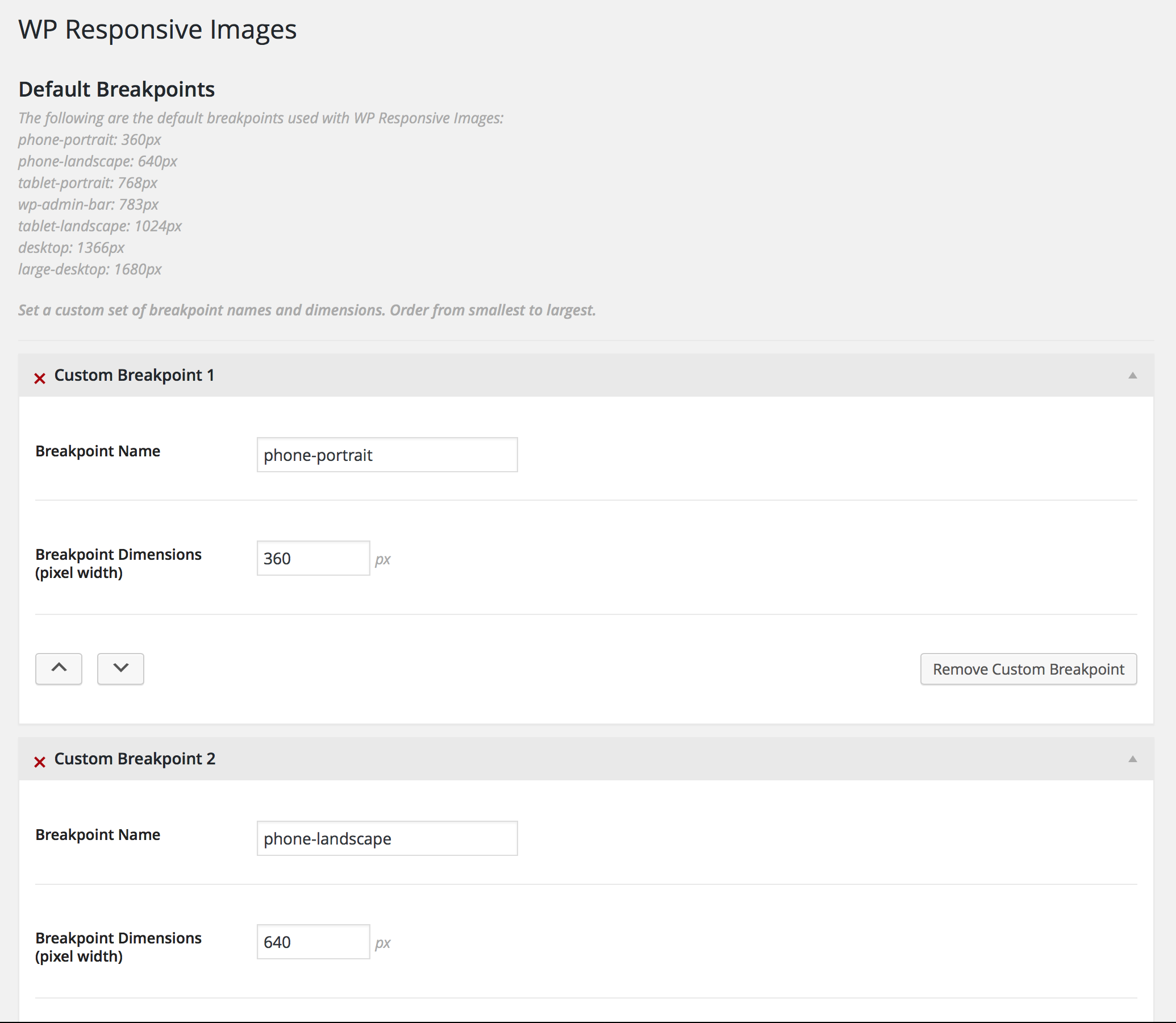
If you do wish to adjust your breakpoints, though, you can always go to the settings page of the plugin seen here:

By entering even a single breakpoint, you are choosing to use ONLY your custom breakpoints and NONE of the predefined breakpoints. There is no “and”; there is only “or.” For the purposes of this post, we’ll use the default breakpoints that come with the plugin.

Like anybody who ever gave a tour of their home on MTV Cribs, it’s time to let you know–this is where the magic happens. It’s at this point where we’ll need to add a JS file to our theme so we can tell the plugin to replace images whenever we darn well please. Let’s take a look at this sample file below and dissect it afterward:
( function($) {

    // Listen for a window resize
    $(window).resize(function() {

        // Set our breakpoint value
        window.setBreakpoint();

        // Check to see if our breakpoint value is phone-portrait
        // If it is, replace the image
        if ( 'phone-portrait' == WPResponsiveImagesGetBreakpointSize() ) {

            // Set the image to a medium size at the phone-portrait breakpoint
            WPResponsiveImagesReplace( '.attachment-single-post-hero', 'img-size-medium' );

        } else if ( 'tablet-portrait' == WPResponsiveImagesGetBreakpointSize() ) {

            // Set the larger image to a large size at the tablet-portrait breakpoint
            WPResponsiveImagesReplace( '.attachment-single-post-hero', 'img-size-large' );

        } else if ( 'desktop' == WPResponsiveImagesGetBreakpointSize() ) {

            // Return to the larger image size at the desktop breakpoint
            WPResponsiveImagesReplace( '.attachment-single-post-hero', 'img-size-single-post-hero' );
        }

    }).resize();

})( jQuery );
Thankfully the person who wrote this plugin left some super great inline comments to make things as easy to understand as possible. Still, we’ll break things down a bit.
The first thing we need to do is kick off a function to listen for a window resize. First, we set the breakpoint that exists on load. That means we don’t need to resize the window to get a value; we’ll already have a value ready for us as soon as the page loads. When we do resize the browser window, though, we’ll check to see what the ending breakpoint value is.
Next comes the real meat (or maybe the real tofu, tempeh, seitan, etc. if you’re a non-meat-eater) of the plugin comes in. We have a conditional set to check if we’ve hit the phone-portrait breakpoint. If we have, we want to replace the img src using the following function:
WPResponsiveImagesReplace( '.attachment-single-post-hero', 'img-size-medium' );
This function is doing a few things:
- It looks for the class supplied in the first argument. This means that any image using the single-post-hero image size is targed
- It takes the desired image size for the second argument. This means that the value specified is the new image size at our targeted breakpoint.
This follows the data attribute structure mentioned earlier. At this breakpoint, we want to replace the single-post-hero size with the medium size. Remember that the data attribute structure is “data-img-size-{IMAGE_SIZE}”, so in order to grab the right data attribute value we must append “img-size” to our registered image size when passing the second argument.

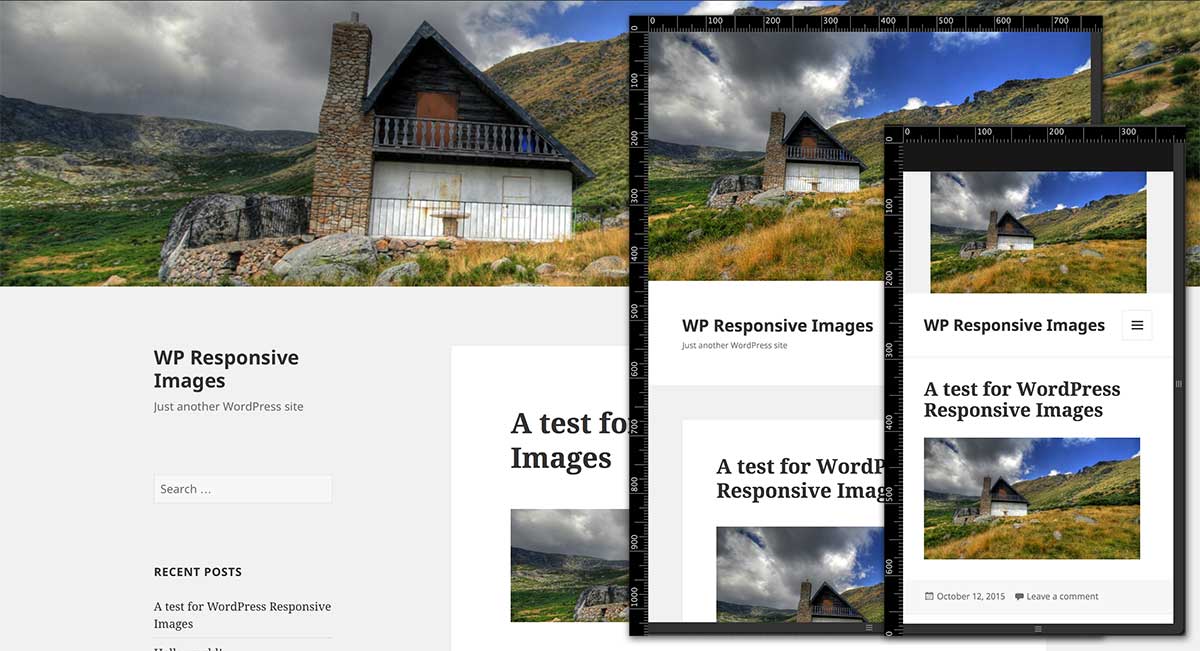
Seriously! That’s it! You can now resize your browser and see the result. You can even open your site using something like Chrome’s dev tools to test and see that your images are replaced at your various breakpoints.

This plugin has yet to be added to the plugin repo as I want to do some more testing and finalize any functionality that may need tweaking, but that’s where you could come in. Have an idea you’d like to see worked in? See a piece of functionality that should be tweaked or could be cleaned up? Feel free to visit the project GitHub and submit a pull request!
Side note: Currently, my plugin works with images inserted using WordPress functions but not yet with images inserted into posts via the media uploader.
Might want to reconsider using the trademark WordPress name in the name of the plugin, as that will probably bite you later, but it’s great to have choices in functionality for this. Looking forward to testing it out.
The WordPress name and logo can be used if the following criteria are met, according to the WordPress Trademark Policy: http://wordpressfoundation.org/trademark-policy/
– The primary purpose of your project is to promote the spread and improvement of the WordPress software.
– Your project is non-commercial in nature (it can make money to cover its costs or contribute to non-profit entities, but it cannot be run as a for-profit project or business).
– Your project neither promotes nor is associated with entities that currently fail to comply with the GPL license under which WordPress is distributed.
That being said, right now the plugin is in a work-in-progress/proof-of-concept stage and if we got to the point where we wanted to toss it up onto the plugins repo, we’d likely run it through the WDS branding (and hype) machine.
Thanks for reading!
Wow, looks great, can’t wait to test it out!
Thanks for reading! Feel free to follow the Github project to stay up to date on the plugin as we continue to work on it.
Thanks again!
First, thanks a lot. I was sitting here perfectly content, but now I have “Living in a Prayer” running through my head!!
Seriously though, I’m so glad I ran into this. I have a project I need to test this on right now. So to be clear, it won’t work with the media uploader or with any slider plugins. The image must be entered manually in HTML so as to have the data attributes in it, is that correct?
If I can get a Bon Jovi song stuck in somebody’s head as a part of my day job, then I think I’ve done a pretty good job.
This will work with images inserted into the theme using WordPress’ template tags; for instance, get_the_post_thumbnail() which you can read more about here: https://developer.wordpress.org/reference/functions/get_the_post_thumbnail/
Thanks for reading, and let us know how it turns out for your project!
This looks pretty cool!
Is there any way to add all this stuff to all the pics in wordpress? Talking in numbers, at this moment one of my blogs host a 365 project with close to 1000 posts (30 to go), in each of them there are at least 1 pic, in some of them 2, 3, 4…10 and so no, depends on the day. I won’t edit manually all of them of course hahaha so, how to implement in all those pics?
Take into account that I’m not a plugin developper, I know something about PHP, CSS and that’s all, but just few things ( 🙁 I want to study more but I don’t have the time to do so :'( sad)
In that way I want it! 😀 You rock!!
This is a must in every blog 🙂
That’s the next step!
Actually, the next step is to see about working with the existing responsive image markup in the latest version of WordPress to make the plugin not only lighter but to also cut down on the legwork the user has to do.
The final goal is to make it so that you wouldn’t have to add and edit a JavaScript file at all, but I wanted to get something “on paper” as a proof of concept to get the ball rolling.
Thanks so much for reading!
I’m following this repository on github. Meanwhile, I (finally) found something else which does this: https://wordpress.org/plugins/responsify-wp/
Alex , this really interesting plugin for responsive imgs, which uses Picture Fill, I think I try it in the feature. Thank you Corey for article.
The plugin chrashes my admin when trying to activate it.
Hi Ian – since this is an older post (about 4 years old at this point), there are probably some things that would need to be updated to work with the latest version of WordPress.
With WordPress’ own handling of responsive images over the years, I haven’t really had a need to go back to the plugin so I’m sure it’s pretty well out of date at this point.