I love me some Sass. I also love the color purple, as you’ll discover below. I think part of the reason I dig SCSS is because you can dip your toes in gradually, which is less overwhelming. As time goes on, you get to continue to discover new things as you dive deeper (and brain space allows).
“Does my sassiness upset you? Why are you beset with gloom?” ~Maya Angelou
Don’t be gloomy; be Sass-y. Sass is powerful because it can increase your code efficiency and helps introduce more modular elements that can be incredibly helpful for using across larger projects.
Sass-y Colors
One thing you might already be aware of is the ability to create color variables (check out our starter theme wd_s for some examples of this). Creating variables is great to help differentiate hexadecimal codes (#DC143C) to something more palatable ($ruby-red-slippers). Let’s use those variables and ramp them up to help streamline other portions of your site!
Color functions combined with the ‘for’ control directive can lead to a magical world of loops. And as someone who works at a WordPress company, I am ALL ABOUT LOOPS.
The code above is an example of utilizing an existing color variable within a ‘for’ directive. Loosely translated into human-speak, it is saying for all elements ( $i ) from one to fourteen that have the class of ‘box’, increasingly darken the background color by a factor of three.
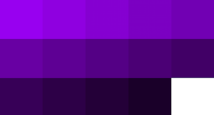 Depending on your content, you’ll wind up with a gradient-type design going through your grid of boxes without having to sort out all the different hexadecimal codes.
Now, what if you want to create a consistent effect across your site for an element like a button? You can create a mixin using color functions to streamline it!
@mixin buttonColorProperties($color) {
    $border: adjust-hue($color, -6deg);
    background-color: $color;
    border: 3px solid $border;
}

@mixin buttonColors($baseColor) {
    @include buttonColorProperties($baseColor);

    &:hover {
      $base-hover: darken($baseColor, 30);

      @include buttonColorProperties($base-hover);
      transition: all 0.25s;
    }
}

.button-purple  {
  @include buttonColors($violet-base);
}
The concept is to supply one base color and let the mixin take care of the other aspects you would like to define. In this case, the button is supplied the base color. From that variable, the hover effect and border are taken care of automatically.
What happens when you combine the first ‘for’ directive with the mixin? You get a lot of purple and a less-than-subtle button design but you also get a gradient of button backgrounds and an automatically implemented hover effect. Keep in mind that you can add other variables within your button design (maybe a highlight or a shadow?).
Go forth and be Sass-y. And if you create a cool button mixin*, be sure to share it with me!
*(Bonus points if it involves purple.)