Appirio
Appirio is a global services company that helps customers create next-generation Worker & Customer Experiences using the latest cloud technologies.

Appirio
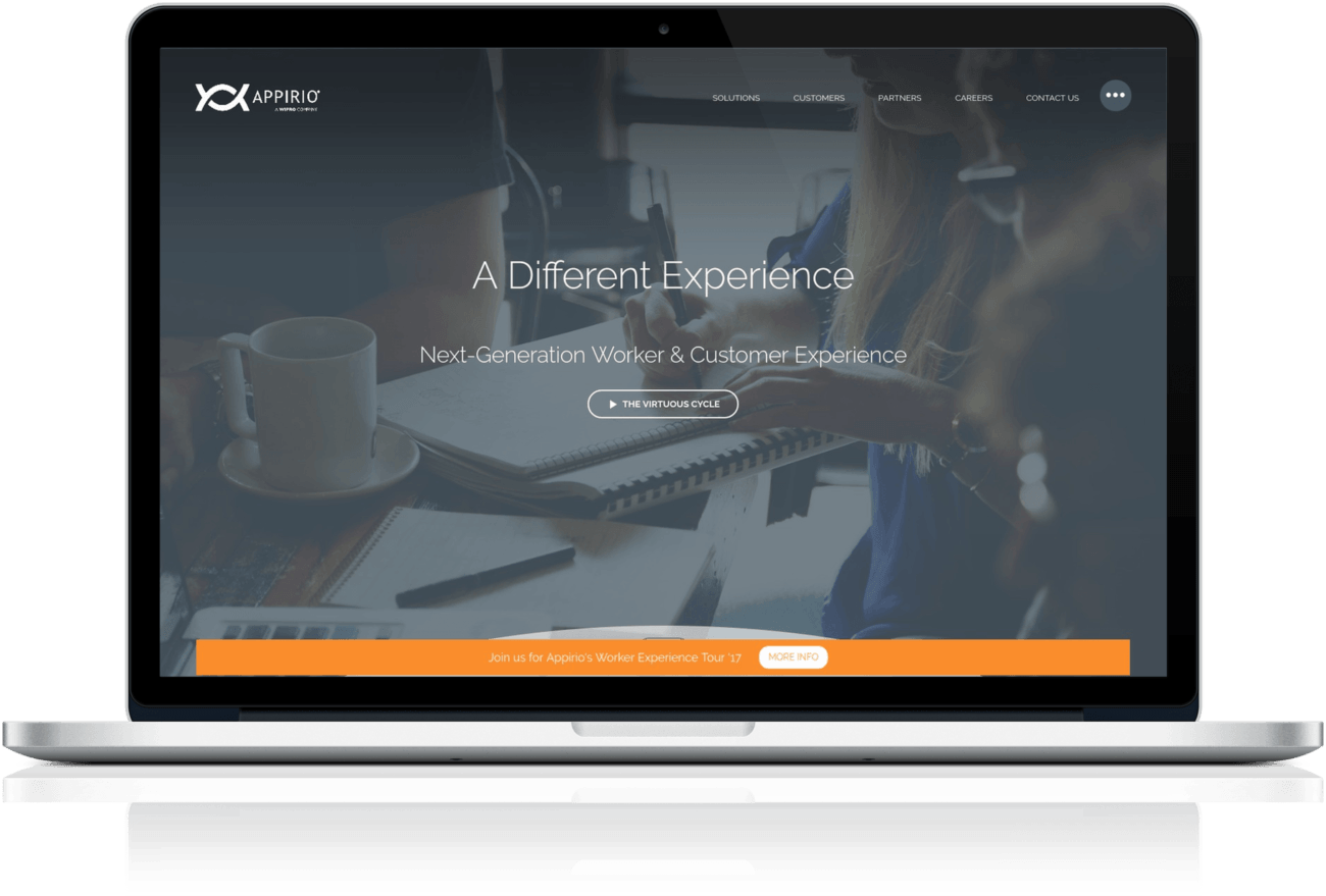
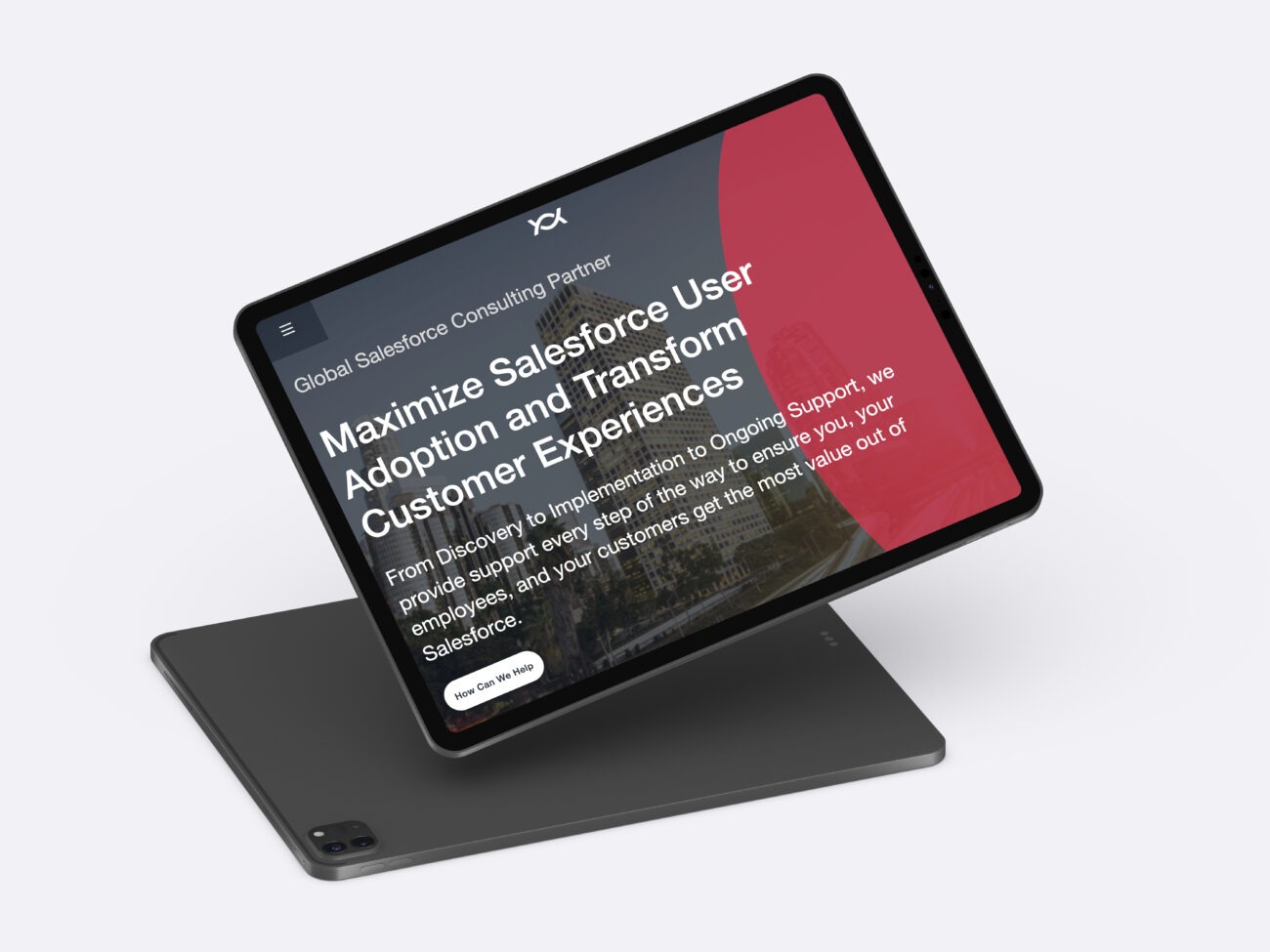
Appirio hired WebDevStudios to do a full redesign on their website; we helped them transform the visuals of their site into something more modern, but also created subtle details that communicate Appirio’s high energy and passion for the work they do throughout the site.
This project was highly collaborative, and we consulted with Appirio on paring down their previous site’s content to make it more parseable. Appirio has a lot to offer in terms of services and client education, and figuring out a way to make that less overwhelming was a key goal in this process.
Note: The website design and development work completed by WebDevStudios for this client may no longer be available and could have been altered since its creation.

Custom Design
Appirio came to us with a burning desire to change the look and feel of their website and overall branding. We worked closely with their team and provided comprehensive visual mock-ups for almost every page of their website to bring their visions to life. We started with the creation of wire frames and discussions around how their content would get represented and organized for each individual section of their website. From there, we created a full style guide for their branding that included details around typography, iconography, imagery and media; including the creation of standard and consistent animated transitions throughout the site to give it a uniform feel.
Overall, we created roughly 25 different mock-ups for their new website. Our approach to customized visual design and UX is very collaborative, which means that Appirio was involved in every step and every decision and ended up with a beautifully designed website, featuring a stunning presentation of their content. At the conclusion of Appirio’s design phase of the project, we gave them a complimentary set of fully branded Photoshop files from their project, along with a style guide. Both, of which, can be utilized to establish consistent branding efforts online and off, as they move forward with their marketing strategies.
Dynamic Priority Content Navigation
Across the Appirio site, we created hero containers that have the standard image, title, and tagline description. Often in page headers like this, users will see a static image or left-to-right navigation through a slider, but we created a dynamic priority content navigation that is tied to a series of icons.
When a user clicks on an icon, it actually changes the entire page, including the URL, without reloading. Each section of the website contains all of these pages and groups them together so that the information can be consumed as a package. This allows the site to load quickly and for the user to glean as much information as possible without any kind of resistance.
Attractive Customer Section
We created an attractive customer section that gives Appirio the ability to feature and highlight some of their high profile customers. We created a grid of 2×2 that displays their clients’ logos, as well as a small blurb about them. At the bottom, we created a logo list of clients that shares fewer details, but allows for Appirio to include them and display the variety of companies they have worked with.
We improved the UX by creating a site that allows them to have greater control over their content. The home page now has a slider area that highlights some of their high profile partners, and in their hero containers, they can edit everything, from the image background text to the header, to display what they feel is most important and update as needed. We also created a way for them to present their consumer education videos and designed a sliding drawer navigation that calls attention to the primary areas they feel are most of interest to their clients. This allows the user to dive deeper into the content, should they choose to do so, with ease.

Easy to Navigate Resources and Blogs
Appirio doesn’t just have one blog; they have four blogs. We created a landing page that organizes all of their resources and blog content by showcasing an overview of all four blogs. Each of the blogs are actually organized through categories on the site and exhibit different topics that are relevant to the work Appirio does and subjects that will interest their clients. Each section has a space for a featured story at the top, with a grid below that displays the four most recent blogs from that section in chronological order. If something catches the user’s eye, they can click into each blog or topic to see more.
We set this up so that the site admins are able to control the presentation of the information on the resources page as needed, and so that the extensive information Appirio provides to their clients was organized, easy to consume, and appealing to the eye.