When I think about a few “game-changers” in regards to how I build websites today compared to ten years ago, I would have to say that WordPress and Sass have completely enhanced the efficiency of my workflow as a designer. One of my favorite features in Sass is the ability to write inline media queries. While there are a number of methods, determining which is best for you and your team is just a matter of coding style and personal preference.
Hands down, the greatest benefit from using inline media queries is the speed of writing and maintaining code. Imagine this scenario:
 You need to make a change to the main navigation so you edit
 nav.scss only to wonder why you don’t see the changes you just made to the menu items. Taking another look at your sass partials, you realize you may have to edit some, or maybe all of these files in order for your change to display properly.
Inline media queries allows you to write and edit each selector in one place. This gives you a much better grasp on what every element is doing at any breakpoint.
The only downside is there isn’t an ideal way to intelligently combine media queries during post-processing. While there are some methods and tools available, I think the issue could use another resolution. On the other hand, leaving these inline media queries in your compiled CSS does not seem to affect performance too much.
Method 1: A mixin that loops through all sizes
Let’s start with the mixin called “wider-than”. Often times this mixin will have other names such as “bp”, “breakpoint”, or “mq.” I like calling it “wider-than” because when writing css it helps get my mind think mobile first. This is especially helpful if you’ve recently converted from max-width breakpoints. Instead of just code, it becomes a sentence: “Do this default thing, then if the screen is wider-than x, do this specific thing.” Keep in mind the “wider-than” name would not be clear if we did decide to add a max-width, orientation, or pretty much anything other than this basic min-width structure.
We also need to set the name and value for each breakpoint. In this example, I am generically using small, medium and large for our breakpoint names, but the names can be much more meaningful to the element or an action that takes place on the page.
// Loop through breakpoints with if/else statement

@mixin wider-than($point) {
    @if $point == large {
        @media screen and (min-width: 44em) { @content; }
    }

    @else if $point == medium {
        @media screen and (min-width: 34em) { @content; }
    }

    @else if $point == small {
        @media screen and (min-width: 24em) { @content; }
    }

    @else {
        @media screen and (min-width: $point) { @content; }
    }
}
Once you’ve set your breakpoint names and values, you can nest them within your selectors with an @include. The code below is changing the width and background color of the .primary selector based on the breakpoints that were set in the wider-than mixin.
.primary {
  background-color: $color-primary;
  width: 100%;

  @include wider-than(small) {
    background-color: $color-small;
    float: left;
    width: 55%;
  }

  @include wider-than(medium) {
    background-color: $color-medium;
    width: 65%;
  }

  @include wider-than(large) {
    background-color: $color-large;
    width: 75%;
  }
}
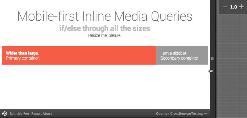
See the Pen Inline Media Queries looping through all sizes by Stacy (@stacy) on CodePen.
Method 2: Create Media Queries using Sass Maps
This next example was inspired by a talk by Roy Tomeij presented at SassConf in 2014 called $lists: For Fun And Profit. In this video, he walks through a few ways to create a breakpoint mixin–the last of which is my favorite. I adopted his concept but went with a mobile first approach. Minimum Requirement: Sass 3.3
// Name and define our breakpoints
$breakpoints: (
  small: 30em,
  medium: 40em,
  large: 50em
);

@mixin wider-than($screen-size) {
    @if map-has-key($breakpoints, $screen-size) {
        @media (min-width: map-get($breakpoints, $screen-size)) {
            @content;
        }
    } @else {
        // Debugging
        @warn "'#{$screen-size}' has not been declared as a breakpoint."
    }
}
Then we would just write the media queries like we did in the previous example:
.primary {
  background-color: $color-primary;
  width: 100%;

  @include wider-than(small) {
    background-color: $color-small;
    float: left;
    width: 55%;
  }

  @include wider-than(medium) {
    background-color: $color-medium;
    width: 65%;
  }

  @include wider-than(large) {
    background-color: $color-large;
    width: 75%;
  }
}
And it would produce the same result:
This code takes advantage of the newer Sass Map feature which makes it easier to create breakpoints. Also, you will see the that we can add better error handling if a breakpoint name was not defined or mistyped.

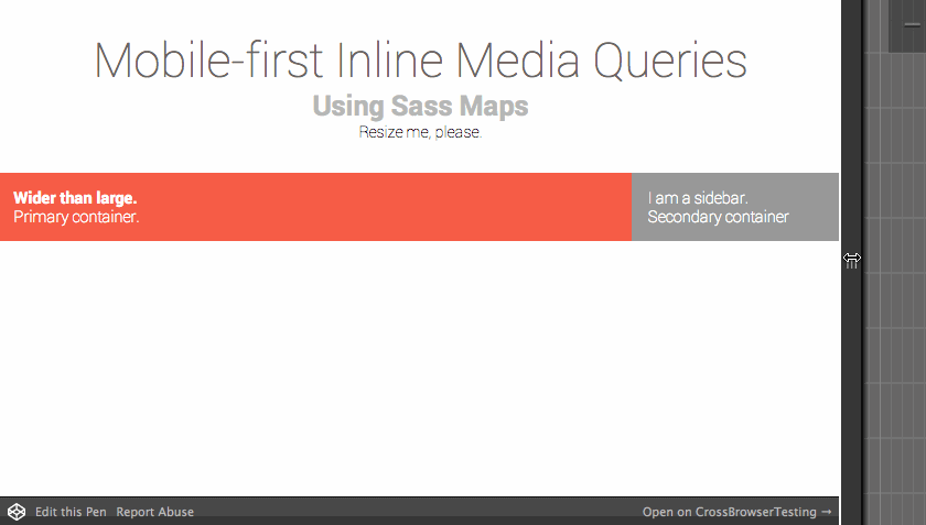
See the Pen Nested Media Queries using Sass Data Maps by Stacy (@stacy) on CodePen.
Method 3: Breakpoint Sass
The first time I looked into Breakpoint Sass I thought, “Eh, we already have a pretty good solution,” but when I actually saw it in action I quickly changed my mind. The ability to pass multiple contextual values to each breakpoint is very useful and declaring them is even easier than the previous two examples:
// min-width is default when only a number is declared
$small: 500px;

// if two numbers are listed, then it assumes the first number is min-width and second is max-width
$medium: 600px 900px;

// if one value is a string, assume a feature/value pair
$large: max-width 1280px;

// string tests together within parentheses, assume each item is a feature value pair
$tall-height: (min-height 1000px) (orientation portrait);
You would @include these breakpoints in your partials using @include breakpoint(name-of-breakpoint):
.primary {
  width: 100%;

  @include breakpoint(small) {
    width: 55%;
  }

  @include breakpoint(medium) {
    width: 65%;
  }

  @include breakpoint(large) {
    width: 75%;
  }
}
Or better yet, using more contextual names based on what happens at the requested sizes:
$mobile-menu: max-width 699px;
$full-menu: 700px;

.primary {
  width: 100%;

  @include breakpoint($mobile-menu) {
    width: 50%;
  }

  @include breakpoint($full-menu) {
    width: 65%;
  }
}
Breakpoint’s control over media query values is very powerful but one of my favorite features is something really basic. If you set $breakpoint-to-ems: true; then it will convert the pixel value you enter to ems!
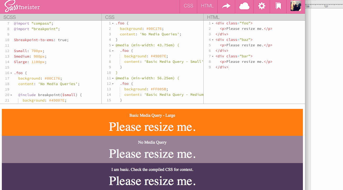
I highly recommend going to this SassMeister Gist to see the scss and compiled CSS in action.
Breakpoint also has more advanced features like No Query Fallbacks and
Context Queries.
I have also been playing with Singularity as a semantic grid system which relies on Breakpoint for media queries.
Have you tried Breakpoint or Singularity on a project? I’d love to hear your thoughts.
Note: Breakpoint 2.2.x requires Sass 3.3.0 and Compass 1.0.0.alpha.13 or higher.
Good article, I’ve been using a similar system myself, which looks like a combination of the two last methods.
I use maps to define my media queries and then use one mixin to call them. The mixin also allows for a custom query if needed.
The downside of method three (in my opinion) is the variable names, as you’ll quickly find yourself namespacing them and cluttering the global scope. I like to limit my variables if I can.
With a map I only use one variable and handle the rest within it.
Example:
$media-queries: (

  pocket: '',

  hand: 'screen and (min-width: 33.75em)',

  lap:  'screen and (min-width: 45em)',

  desk: 'screen and (min-width: 55em)',

  wide: 'screen and (min-width: 70em)'

);