Every company in the world is trying to sell an experience—from Apple to McDonalds to Disney World. Whether we’re truly aware of it all the time, we’re experiencing things every second. Someone is either selling us the experience itself, or that experience is leading to something we’re being sold.
Think back to the last time you waited in a room at the doctor’s office—had they planned in advance to make your wait as enjoyable as possible (well, as enjoyable as waiting for the doctor can be)? Was there a TV to watch, a decent magazine selection, and perhaps a water cooler? Were the staff organized and ready to get you to the place you needed to be? When the doctor entered the room, was she kind and professional?
That’s what I’m talking about. It probably wasn’t why you went to the doctor in the first place, but it was part of the package. In the same way the staff had planned to make your wait more bearable, you can anticipate the needs of your users and craft a better experience for them. Let’s look at a real world example of what this looks like, and talk about how to make your contact page even better by predicting what your users want and need.
The Classic Contact Page
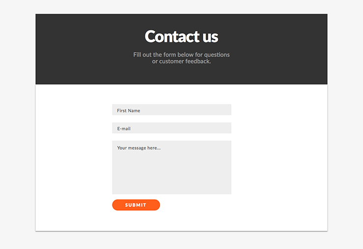
The web form—the internet equivalent of waiting in line at the DMV or doctor’s office. Nobody likes filling these things out—web designers don’t even like making the darn things! But they are an essential form of communicating information between you and your user, and they’re certainly not going away anytime soon. Let’s look at the classic contact form. Almost every website has one. Most of these are very sparse, and little thought goes into them. Take a look at an example of a basic contact page: a generic block of text at the top, a simple form, maybe a phone number and email address if you’re lucky. This is actually a best-case scenario for a lot of sites; many contact pages don’t even include a phone number or email address (which can be really frustrating for users who need some immediate help).
So how can we improve on this page?
Let’s tinker with the contact page formula a little bit, starting with the form. Instead of providing the generic name, email, and message fields, take a moment to consider why your user is coming to your contact page. This will vary depending on your industry and the purpose of your site, but let’s assume you have a membership site for comic book fans. The site has hundreds of posts on comic books, a forum, and even a Frequently Asked Questions page.
Doing the Research
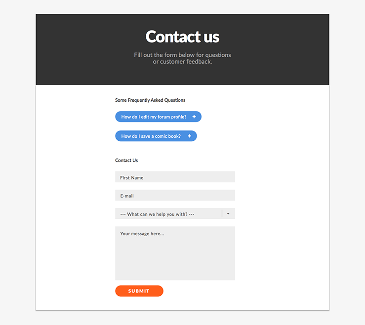
Since we already have a lot of helpful information on our site, let’s provide the user with a few different options for getting in touch with us, as well as a link to the FAQ page. WooThemes does a good job of this on their contact page by highlighting the methods of contacting them and matching it with specific user needs. Do some research and find the most common reasons your users reach out to you; this will allow you to anticipate what they’re looking for.
For the comic book site, we’ve already done this research and found that users most often fill out the contact form to report a bug, inquire about a change to their forum profile, or request new features on the website. We can save these users, and the website staff, a few steps (filling out the form and replying to support emails) by linking to our FAQ page article on how to change information on your forum profile. We can add a few buttons at the top of the form for these FAQ items so that users will see them before filling out the form.
For the other items (bugs and feature requests), we can add a drop-down menu to the form asking the user how we can assist them. Depending on their answer, we can conditionally load more questions suited to the selection they made, such as an image upload field for sending a screenshot of a bug they found. Many WordPress form plugins allow you to easily create these conditional options—check out Gravity Forms and Caldera Forms for more information on this technique.
Getting Personal
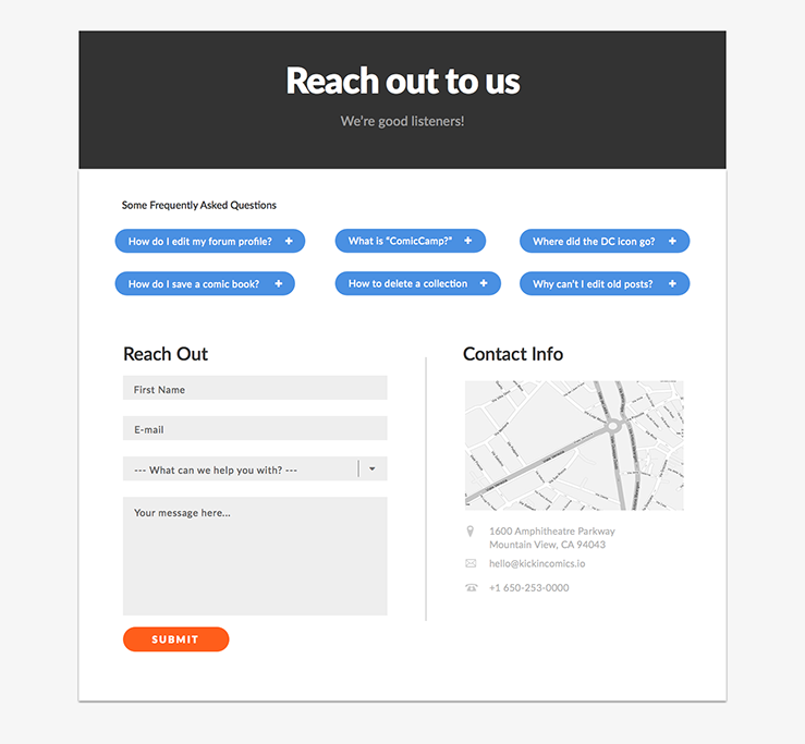
The comic book site is light-hearted and fun, but the contact page is still feeling a little too rigid and dry. We can still make this page more enjoyable and useful to our users by making the page more personal. Let’s start with the language used on the page. For starters, “Contact Us” is generic and has little meaning. By changing this to something like “Reach out to us. We’re good listeners,” we make the page more engaging while also sounding like we actually want to hear from our users. We can also cut out the generic text block that tells the user to “Fill out the form below for questions and feedback.” Most users know what a contact form is and how to use one. We can also change the default “Submit” to something more meaningful such as “Send Message.” Hubspot looked at over 40,000 pages and found that pages using text other than “Submit” for buttons had a higher conversion rate.
Call us maybe?
We wouldn’t be fully anticipating user needs without providing some alternative methods of contacting us. The best contact pages provide a phone number, support email, and address or map (if appropriate) in addition to the form. This shows we’re looking out for the users who simply want to shoot an email directly to support or chat with someone over the phone. If you’ve ever done usability tests on a site without an email or phone number, you’ll know how frustrated users can become when they don’t have these additional options.
We’re done now, right?
At this point, your contact page should be providing a much better experience to your users, but the job is never over when it comes to improving the user experience! Think about other pages on your website and how you can anticipate user needs for those pages—does your staff page have email addresses and social profiles? Do your blog posts contain related content or suggested articles? Try to take a few minutes to assess ways of meeting user needs on these pages. Feel free to comment below or email me if you’d like more tips or have questions. I’d also love to see examples of how you’ve anticipated user needs on your own site.