Whether you’re a theme designer, freelance developer, creative lead, or any growing number of web-related job titles, chances are that you use Photoshop. Some, like myself, probably use it every day. If you’re designing the next big WordPress theme or slicing a designers Photoshop mockup in preparation for coding, there are some definite best-practices to follow that will help the transition into a WordPress site be more seamless.
Let’s take a look at some simple tips you can incorporate into your workflow that will have you moving between Photoshop and WordPress like they were the same program!
Planning
As with all things in life, planning before you take action will inevitably save you time and frustration in the long run. When you’re dealing with multiple projects, clients, and team members, this is even more true. Having a set routine for dealing with each of these projects will have you moving faster and faster with each new project.
So what should you plan for? Here are a few general WordPress–specific things to plan for, but always be sure to evaluate these on a project-by-project basis.
Plan for real world situations
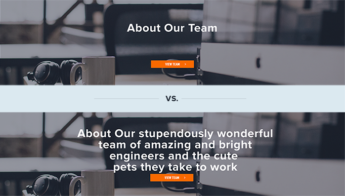
Sure, the design looks amazing with those two word titles and crisp, retina-ready placeholder images, but also try mixing in content from the client’s current website if she has one, or if you’re designing a commercial theme, just make sure the design won’t break when a user creates a long title or forgets to add an image to the post.

Plan for all kinds of content types and containers
WordPress is a very flexible system and allows for sidebars, widgets, custom post types, and many forms of variable content so making sure your design accounts for these situations is imperative to a great theme.
How will content be entered for each section? Most of our sites are a mixture of traditional pages, posts and custom fields built using CMB2. Try to make sure the design will make sense and be as easy as possible for the user entering content.
Communication
Keeping communication open instead of getting locked into working through the design of the theme is key. Talk with project managers and stakeholders to ensure you know what the expected functionality is that you’re designing. You can really impress the client by showing them animations, transitions, and user-flows between pages by using an app like InVision, and you’re also making sure that whoever is developing the site doesn’t have to guess about what each piece is supposed to do or look like when it’s interacted with.
If you won’t be developing what you design, keep a steady stream of communication with your team to make sure that what you’re producing in Photoshop can be implemented in code within your budget. Often you’ll find that you need to come up with a solution that will be easier to code but looks just as nice as the previous one.
The PSD
Photoshop is truly a beast of a program, with most web professionals only using a small set of its features. But with great power comes great responsibility, as everyone’s favorite neighborhood spider would say. How can you ensure that the developer (whether it’s you or someone else) can easily navigate the PSD to find what they need? Here are some tips I’ve found quite useful over the years:
Take advantage of Photoshop CC Libraries
Use this as your theme’s style guide, where you define colors, typography, and other commonly used elements. Defining these early on and using them instead of the old “duplicate layer” method or creating from scratch each time will not only save time but also ensure a greater level of consistency through the many pages and sections of the site. It also makes it easier for someone else to come along and add to the theme.
Use Photoshop’s Generate Assets exporting command
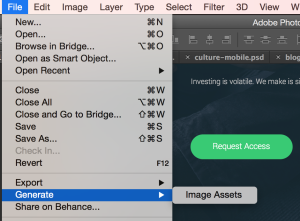
This will allow you to quickly export any bitmap images inside your layers, which saves the dev a lot of time and is more accurate than the old “slicing” method. You can access this by going to file > Generate > and checking “Image Assets” as shown in the screenshot. This has the benefit of being faster and more accurate than the traditional slicing method used in the dark ages of web design (2002-2007, approximately).

Descriptive names and good organization
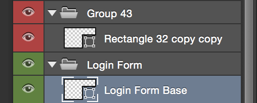
Keeping a neatly organized document is good for the sanity of everyone on the project. One of the best things you can do is to simply give descriptive names to layers and groups. In the image shown, which layer group and layer name makes it easier to see the purpose of and connection with the rest of the design? Pretty clear, huh? Even when you’re under a tight deadline, try to make time to properly name and organize your layers–you’ll be saving a baby deer every time you do (or at least keeping the office bottle of Advil less depleted)!

Optimize your images–do it for the children!
Whether you’re using a preprocessor like Grunt, or using an optimization service such as WPMU Dev’s Smush Pro Plugin or TinyPNG, it’s important to provide optimized images when transitioning from Photoshop to WordPress. This will help ensure the end user has the shortest wait time possible when loading your website. Nobody wants to wait ten minutes on your cat images to load over their 3g network while they’re trying to find out Mr. Biffle’s Top Ten Favorite Hiding Spots of the Week!
Those are my tips and best practices for moving from Photoshop to WordPress, but I’d love to hear some of yours. Feel free to drop them in the comments below!
Ah, WordPress. There was a time when it was so delightfully easy to use that I could quickly do websites for various charitable organizations and other worthy causes, knocking it off in a weekend.
That was then. This is now. WordPress has become so incredibly complex and difficult to use that I have been forced to abandon those sites that did so much good. The teckies that created the original just could not seem to resist tweaking and tweaking it to the point where I, at least, find it unusable. What a pity!
Really good tips Cameron! I think every web designer should learn how to be able to design a site for WordPress. We recently wrote 15 tips for designing a website for WordPress, which you might find useful as well. Let us know what you think! https://goo.gl/J4g5fs
Hmm great tips for photoshoppers, I am also searching way through which I can my PSD files to develop a landing page in wordpress. If you know any way to do it then please let me know. However I also love your writing style. Thanks
Thanks, Ajit! Depending on your familiarity with Front End technologies I can definitely recommend Morten Rand-Hendriksen’s Lynda courses on building sites in WordPress—he takes you pretty much step-by-step and you can apply what you learn to your own landing page/PSDs. https://www.lynda.com/Morten-Rand-Hendriksen/725535-1.html
I hope that helps!
Hmm Thanks Cameron, That link is worthy and I am planning to attend the course. Thanks a lot
WordPress is easy to use and you can use plugins to reduce your workload, there are many good plugins for SEO and Image Optimization.