As of late, I’ve been on a bit of a journey to become more adept and knowledgeable in the area of website accessibility. It’s not simply as easy as throwing a few extra alt or title tags here and there, or making sure you have a “Skip To Content” button. What I am finding is that there is a fundamental shift in philosophy required to tackle the challenges of accessibility.
Here, I’ll discuss some of those, as well as why we all need to become more mindful of the web in which we are working and the web for which we are building our sites, so that they can be used by all people regardless of their capabilities. Let’s start at the very beginning. What is web accessibility? W3C defines web accessibility as such:
Web accessibility means that people with disabilities can use the Web. More specifically, Web accessibility means that people with disabilities can perceive, understand, navigate, and interact with the Web, and that they can contribute to the Web. Web accessibility also benefits others, including older people with changing abilities due to aging.
– Introduction to Web Accessibility
This makes sense, right? We don’t want to limit the information on the web due to conditions beyond a person’s control. Instead, we should be ensuring that information is not only available and accessible to those with disabilities, but also presented seamlessly to those without disabilities. In essence, web accessibility should be invisible.

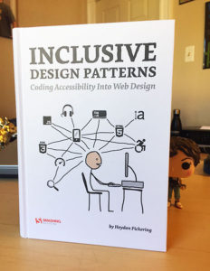
This, and the other passages in the book, resonated with me quite a bit. It helped to take me from a place of, “We need to make sure we check to make sure the site is accessible,” to, “We need to set higher accessibility standards in our framework.”
Too often, I think, accessibility does become an afterthought because those of us who are building a site may not have any personal experience with a disability or condition which precludes us from using the site to its full potential. For this reason, it is easy for accessibility to become an “out of sight, out of mind” (for lack of a better phrase) issue. That, combined with just assuming that the website will magically be accessible to all users, is where we as developers find our pitfalls.
We can’t just assume that because a website looks good to and works well for us and the client that it is a flawless masterpiece, which works for all users. More often than not, this will likely not be the case. Perhaps we haven’t checked our color contrast levels, and there are some questionable light fonts on light backgrounds. Maybe some of the triggers on the site which should be buttons are actually spans or divs styled in such a way to act as buttons. It could even be as surface-level as heading tags not being used properly throughout a document, creating a confusing experience for a screen reader.
Whatever the case may be, these are all more than cases of code cleanup or QA. These are perfect cases for changing the way we look at the web, the way we think of the web, and the way we build the web.

Think about it like this: you are building a website for a service which, primarily, will be used by an audience who is very in-tune with the design and functionality trends of the day. You want a sleek design with sharp, modern fonts, which aren’t too in-your-face in regards to size and weight. Generally speaking, larger font sizes are associated with users who have a harder time reading smaller fonts. In fact, Barnes & Noble offer over 60,000 large print books to serve an audience who may have trouble reading the smaller print found in a standard book.
Ask yourself, if you are someone who doesn’t require a large print book to read comfortably, are you hindered in any way if you are, in fact, presented with a large print version of a novel, rather than a standard print version?
No, absolutely not.
Your experience is absolutely the same. You are reading the same words in the same language. The only difference is the size of the font being used.
This is the balance we need to strike with web accessibility. Should you design your site with smaller font sizes which sit on backgrounds whose contrast points are extremely low for the sole purpose of achieving a certain look or aesthetic? Or, could you take a few extra moments in the beginning of your design process to ensure that what you are designing is going to be large enough and displayed with enough color contrast to be easily read by all of your potential users?
In one of the above scenarios, you are limiting the number of users who can comfortably use your site. In the other, you aren’t placing limits on who can use your site. Or, at least, you are trying to ensure your site is presented without limitations to all users.
For me, beginning the journey into learning more about accessibility has been an interesting one, and one which is changing the way I look at, interpret, and develop. Accessibility does not, and should not, mean presenting a lower-quality or different experience to users due to a disability or condition. Instead, it should be that all users, regardless of their backgrounds or abilities, are able to experience the same content on the same web inclusively.
Comments