Website design trends for media publishers is a continually moving target. In this industry, the life cycle of a website can be much shorter than that of a small business or company, especially in the world of lifestyle blogs. Many of the most popular media publishers rely on just a handful of things to get their users attention, keep that attention, funnel users to achieve some conversion, and keep them coming back for more.
These things aren’t design-related, but inform design, and to date, there are several conventions at play to accomplish those goals more effectively. Use the recommendations below to get user attention, keep their attention, funnel their interactions, and retain that interest.
Grab User Attention
You have one shot to grab your user’s attention, approximately seven seconds, which is already longer than the average time spent on any given web page to begin with, so you have to make it count.
Make a Big Impact
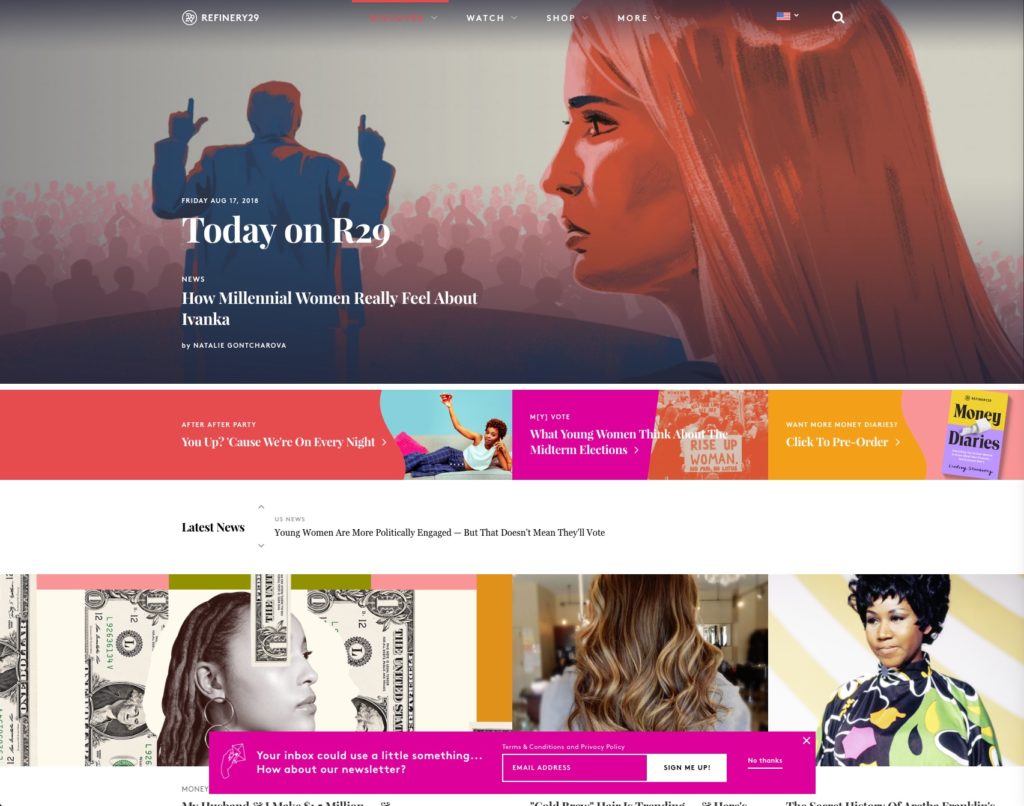
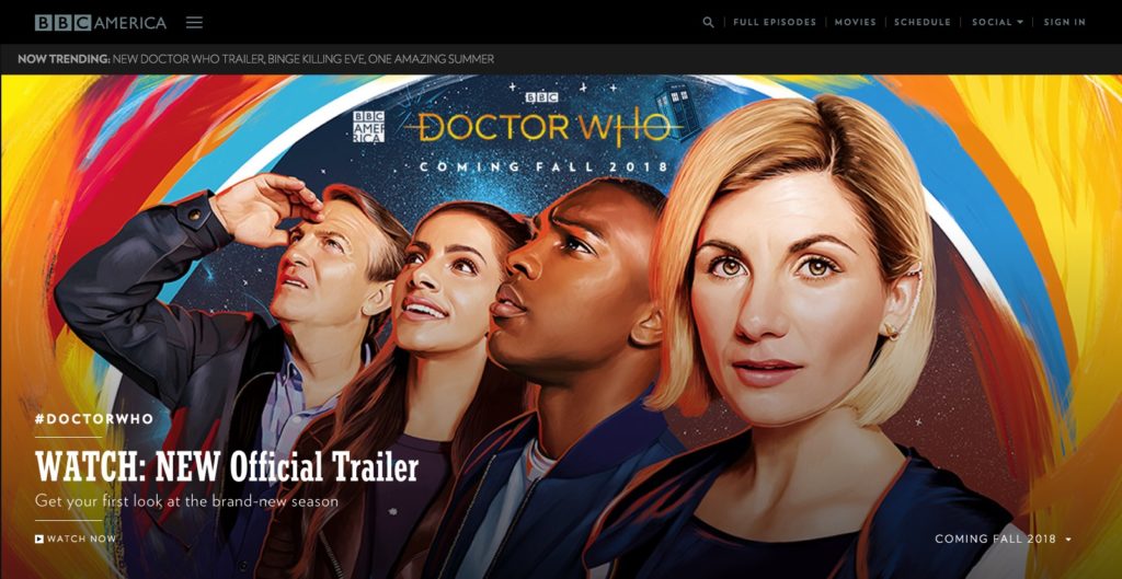
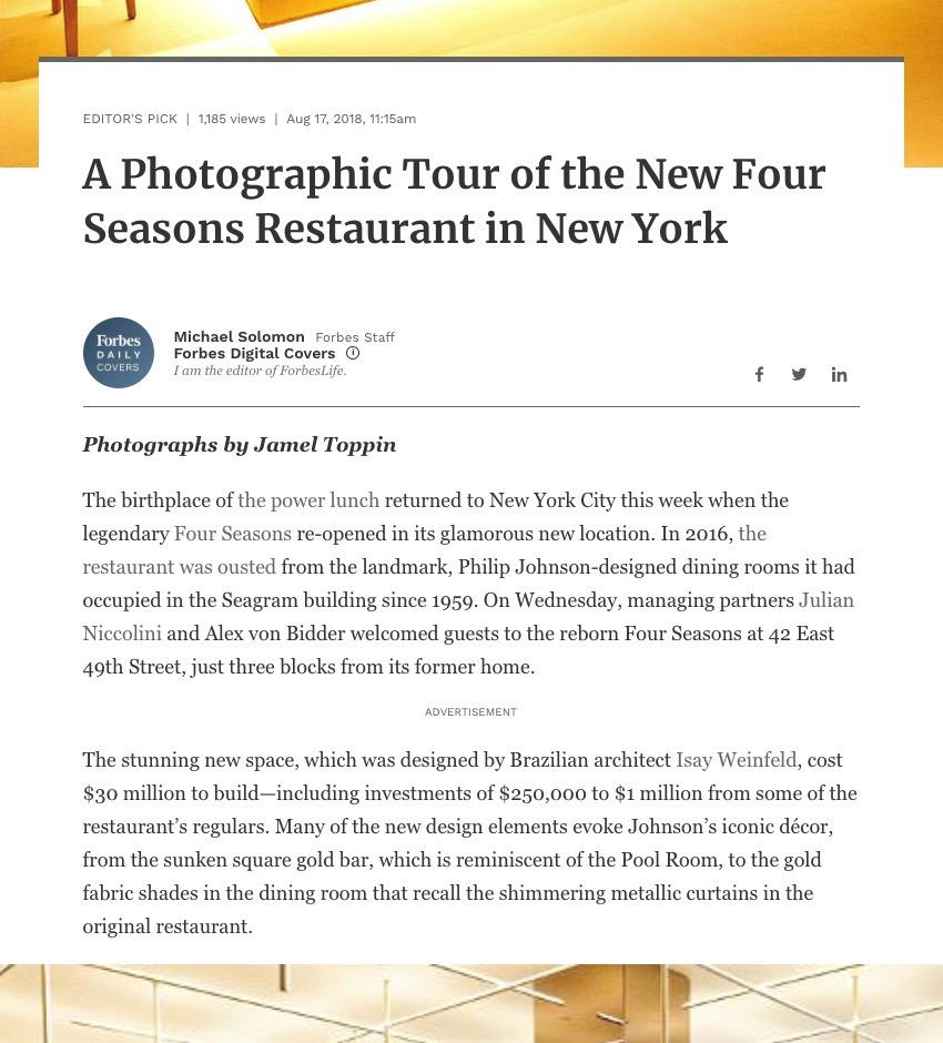
A significant trend right now is bright, vibrant, full-screen and saturated blocks of content. These don’t typically serve any immediate purpose other than to grab your attention. This sort of block typically limits content to a single call to action to content header/title to avoid unnecessary hangup before moving into relevant content. A successful block may fill your immediate viewport, provide some element for conversion—up your wow factor!
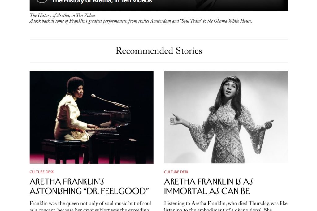
Making a significant impact doesn’t always mean flashy colors or vibrancy; this is a current trend in web design, but even a more subtle approach has subtle inflection to enforce a big impact. The New Yorker, for example, utilizes very subtle emphasis in type treatment to pull your eye. The first thing you’d see on the homepage is the first article in the middle because of the image placement, type treatment, and the title—despite it’s inherent lack of “flair.”
It’s all about getting your piece of that seven seconds.
Give a Clear Direction
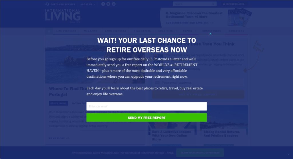
One of the up-and-coming trends in web design is to fill the screen with the call to action, or provide a full-screen look above all of the homepage content which helps avoid the appearance of a popup, a thing we all hate. There are many reasons for this. Making a significant impact is one, reducing the number of assets needed on page load is another [see above the fold optimization], and potentially triggering an immediate conversion. And, despite what you might think, users know to scroll down or find navigation on the internet.
The problem that arises with this sort of “Big Impact” trend is that navigating forward, away from, or anywhere else can sometimes become a problem. Make sure that your user can navigate away from the call to action easily by providing multiple ways to dismiss a full-screen popup, clear direction for non-traditional scroll navigation (next or previous buttons with hijacked scroll), or whatever is needed to continue the stay on that page. If users get frustrated with the experience you’ve provided, they will bounce.
Keep User Attention
By now you’ve made an impact and have grabbed your user’s attention, but now they want more. You need to give it to them and keep that attention.
The most important thing here, as far as design is concerned, is that you want to avoid additional non-essential design elements or any content obfuscation. Your user has visited your website for a specific reason. Making sure that you can clear the path for user self-discovery is essential.
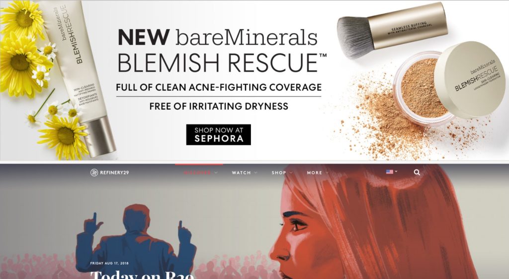
Current trends tend to be to make articles or content as simple as possible, text-only treatments accompanied by subtle design elements to avoid confusion. Keeping the user’s field of vision free of ads or additional information is important.
Analytics can help determine what people are looking for based on your company, but an article, title, published date, author, and content are probably the only things you’d want in view once you have a user’s attention.
And as we start to clean up that user experience, we find ourselves in need of ways to get users more engaged. Sidebars used to be commonplace and usually come pre-packaged with most website platforms, but the trend is to move that “related information” away from the main content and into the footer. Remember, your users will scroll.
Funnel Users
For media publishers, or any company whose website drives conversion in some form, funneling users to accomplish a goal of some kind (a conversion) is one of the most critical aspects informed by good web design and one of the most natural things to overlook when trying to follow current trends or are designing a website refresh. Most of the time people think in terms of “flash” over end goals.
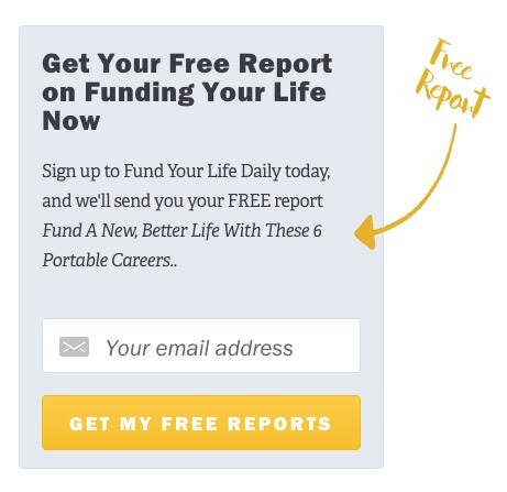
A funnel intends to lead directly to conversion. Conversions, among others, are things like social sharing, signing up for their service, or signing up to receive updates, making a purchase, etc. It could even be clicking links that direct you to another part of the website, providing some other site-specific interaction, or even prompts to disable the ad-blocking software, something that’s growing in popularity (infamy) among modern websites.
Good design serves a purpose, is easy to understand, and allows quick and easy access to conversion, whether you know it or not. Many websites provide persistent signup or sharing interfaces along with easy-to-understand bits of information to aid that decision.
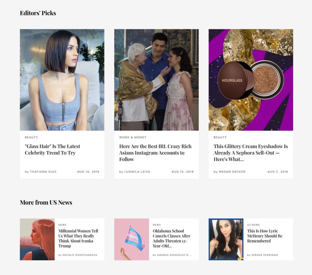
Refinery 29 uses a persistent title bar with sharing options, visible at any point when sharing is not available during scroll.

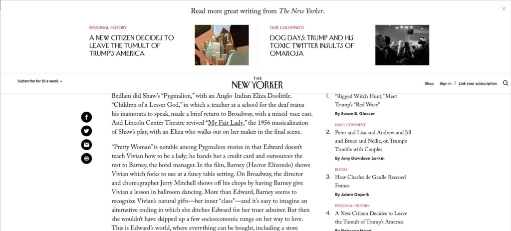
The New Yorker also uses a fixed set of social icons and persistent “related articles” at the top to entice additional sharing and site interaction.
For websites that are content-focused, like A Practical Wedding or Discovery, Inc., bring attention to social sharing and “spreading the word” and generating subscriptions.
The ways that you can funnel users is endless. These are just common ones. The main takeaway here is that interaction needs to be clear and easy to access, but not take away from the user’s experience of consuming information or making a decision, but rather inform it. The trend is to make this as unobtrusive as possible; whereas previous web design trends would first shove the conversion in your face, frustrating new users.
Retain Interest
Once you’ve grabbed your user’s attention, kept them around long enough to funnel them into interaction/subscription buckets, your end goal is to now retain them, which is, sad to say, not a result of good design. It’s a content consideration. Your users are expecting consistently excellent and new content. Without a continuous stream of fresh content, users will unsubscribe or slow down on interaction, leading to lower revenue from ads or sales, lower conversions/subscription rates, and plateaued website interaction and sharing rates.
Know your audience and generate new content—lots of content.
One thing that does help retain users is brand information. This is not a trend, but I feel it’s important to talk about. Making sure that any materials that are sent from your website/platform should continue to inform users that it is YOUR content. This email is from you, and you can find more information at SUCHANDSUCH.com. Consistent branding and continuously informing people of who you are keeps your brand in the mind of your users. It can also mitigate potential issues with phishing or brand hijacking and help you retain brand authenticity.
Going Forward
Going forward these design trends will undoubtedly change, become more complicated, become less complicated, or transition to different platforms or modes of delivery, but the goals won’t change. Accomplishing those goals is just a matter of keeping up to date with design successes and failures on the internet of things. One way you can do that is right here on the WDS blog. You can also contact us when you’re ready to implement these trends. Let’s partner together and keep your media publishing website fresh and on trend.

Comments