Let’s start by briefly defining what a call to action is. A call to action, commonly referred to as CTA, can describe any piece of content on your website that you want users to take action on. This could be a simple “Read More” link on a blog post or a large, stylized banner asking users to sign up for your newsletter or other service. Virtually every website and app has some type of CTA, and it’s important to give them proper design considerations in order to make them as effective as possible. For the purpose of this article we’ll focus specifically on design tips for call-to-action buttons.
CTAs are important because without them you’re leaving it up to users to find things they need (or worse, leave your website). Your aim should always be to reduce the cognitive load on users by making things simple and easy to execute. A successful CTA should be succinct, well-designed and accessible to users with a wide range of experience and abilities in order to maximize the amount of people who can see and interact with them.
Now that we have a bit of a foundation, let’s dive into ways you can maximize the effectiveness of your call-to-action buttons.
CTA Text
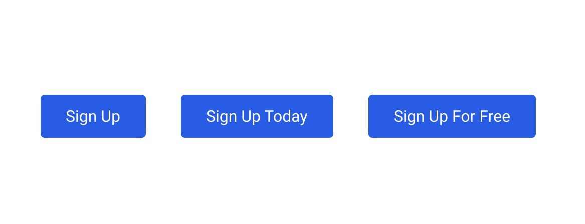
The text for your CTA button is just as important (if not more) than how it looks. Some users may be more likely to engage with a button that includes actionable text such as “Now” or “Today” as it generates a subtle sense of urgency.
Letter case in buttons
Another thing to take into consideration is the letter casing of your call-to-action buttons. In most cases (pun intended), you’ll want to decide on a single format (all-caps, lowercase, sentence case, etc.) for consistency. This should also align with your brand voice. Using all capital letters (aka, all-caps) may be too aggressive for a dog-boarding website but could fit in with a more serious-toned brand or more urgent CTA (like donations for a nonprofit).
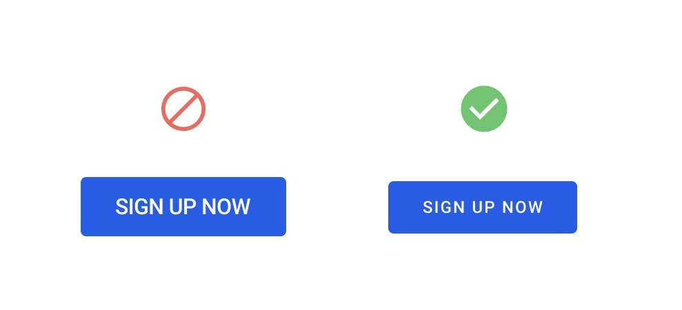
The case of your button text should also influence the text itself; for example, using actionable phrases like “SIGN UP NOW” combined with all-caps could be perceived as too forceful. If you do choose to go with all-caps text, you should also make sure the CSS styles for the text are optimized. Take the following example where we’ve added some letter spacing and reduced the overall font size to make the button feel more professional and less forceful.
Test, adjust, repeat
Just because you’ve written a seemingly effective and concise CTA doesn’t mean your work is done, either. There are lots of case studies of high-profile websites that tweak their CTA messaging based on data such as analytics, user testing, and heatmaps. Former Mailchimp designer, Aarron Walter, discussed in his book, Designing for Emotion, how Mailchimp saw an increase in signups by simply changing the button text in their header from “Sign Up” to “Sign Up Free.”
Accessibility
When designing your call-to-action buttons, you should also be considering the various accessibility issues involved. In terms of the actual code of buttons, there are a lot of things to consider such as aria-labels and other functionality for users navigating your site via keyboards, screen readers or other forms of assistive technology. We’ll stick to design considerations for this blog post.
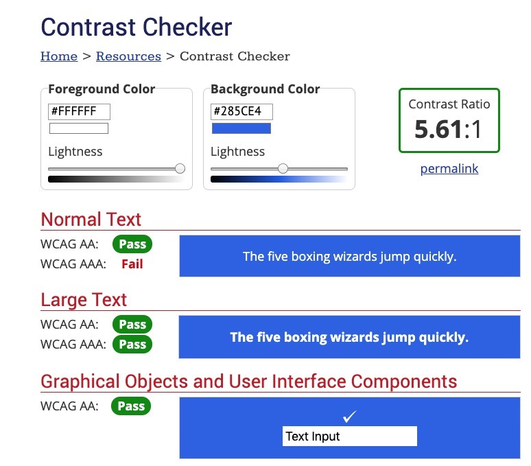
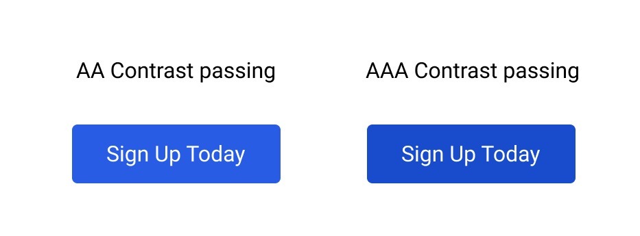
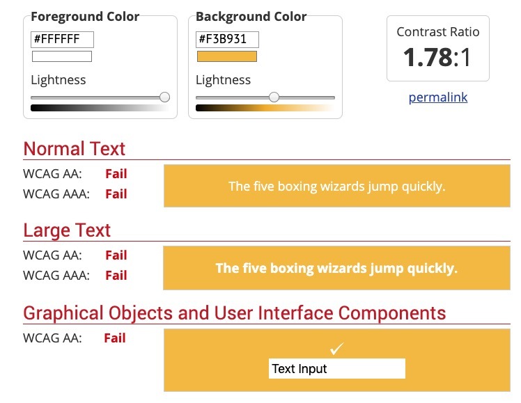
The first thing I check when designing buttons is color contrast. There are free tools like the WCAG Color Contrast checker that allow you to plug in your hex code values to check the contrast. Poor contrast means that users with less-than-perfect vision (a lot of people), color-blindness (about 8% of the male population in the US), or other forms of impairment, will have a hard time reading your button text. This can be tough when your main brand color is on the brighter end of the color spectrum (such as yellow, orange, red, green, etc.). You should always aim for at least passing AA contrast. You can see the buttons so far in this article pass for everything except normal-sized text for AAA contrast. If we want to shoot for AAA, it’s as easy as selecting a slightly darker button color or changing the text color.
This was a pretty easy example, but what if you have a tough brand color such as yellow? Let’s look at some ways of working within that constraint. We can see that out of the gate, this yellow fails all the checks for color contrast, but fear not; we can apply some creativity and have this passing contrast checks in no time!
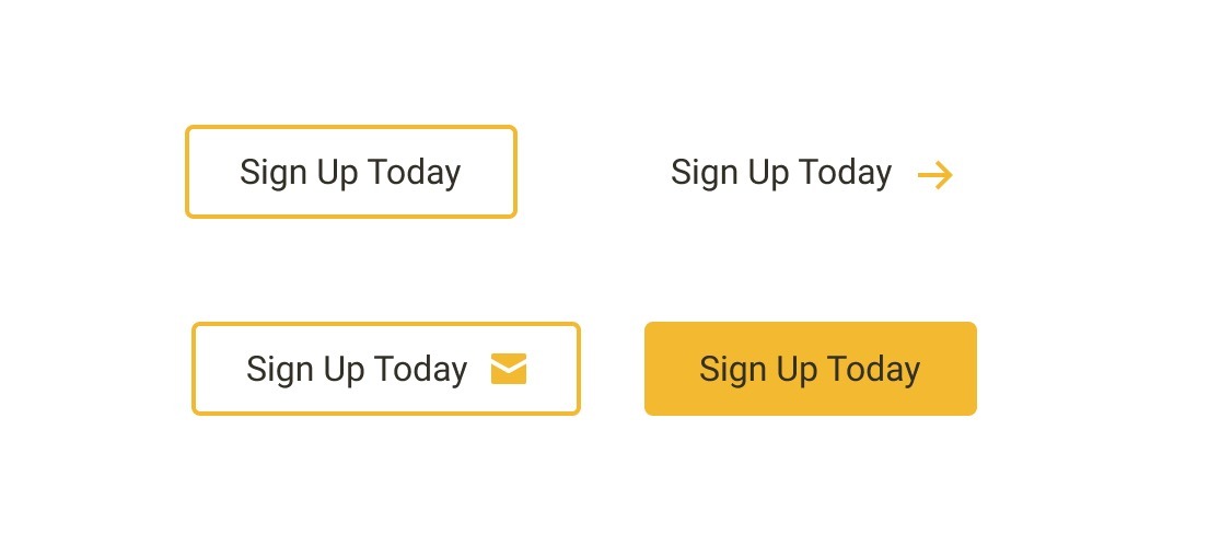
Here are four potential ways of using the yellow brand color from before but in contrast-friendly ways. We can use an outline (or ghost) button style with the brand color as the border, text and icon combination, or a combination of both. You can get creative and come up with even more variations.
Design
Lastly, let’s look at some overall design considerations for your call-to-action buttons.
Padding
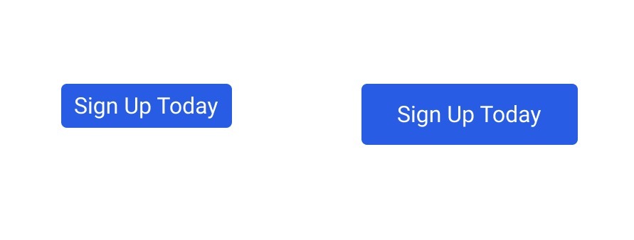
One of the most common mistakes I see with CTA buttons is simply not having enough spacing (or padding) for the button. This leaves the text feeling cramped and awkward, while also making it harder for users to click or tap due to the small amount of real estate. Not to mention, it makes your CTA seem less professional or legitimate. Aside from these items, the button on the right just looks more “clickable” than the other button, wouldn’t you agree?
Spacing
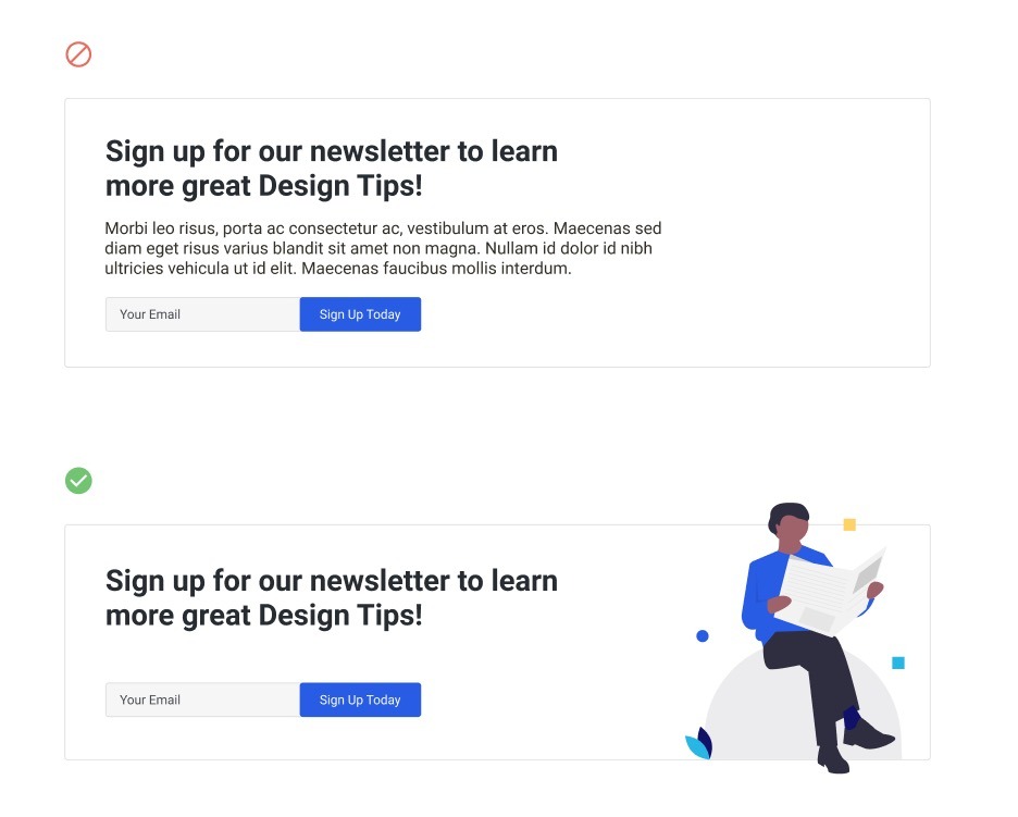
The spacing and proximity of your CTAs to other elements on the page is incredibly important in drawing attention to them. Make sure that your CTA has plenty of breathing room (white space) to increase engagement and so it doesn’t get lost in a sea of elements vying for attention. You should also take care not to overload any given CTA section with too much content. One sure-fire way to turn off users is overloading them with text. Sometimes, communicating an idea with a single, snappy heading and nice image will draw far more attention than over-describing an idea with paragraphs of text.
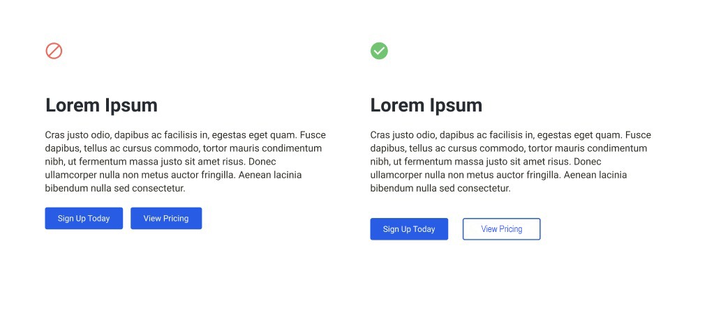
Multiple CTAs
There will be times when you will want to display a primary and secondary CTA in the same component. When you need multiple CTAs so close together, it’s important to consider the spacing rules we already covered. You’ll also want to make sure that you’re giving visual priority to your primary CTA, as opposed to giving equal visual weight to both (i.e. you need to make it clear to the user that one is more important).
Closing
Whether you’re running an enterprise-level corporate website, a large-scale media site, or a consumer goods website that helps people track down their favorite products, the design decisions you make in regards to your CTA buttons can either convert your visitors into loyal customers or provide no impact at all. Use these tips and guidance to ensure you’re making the right choices for your CTA buttons.
Ready to improve the CTA buttons of your website? Talk with our team. We’d love to strengthen the design elements of your call to actions and improve your conversion rates.