What is a design system?
If you’ve never heard of a design system before, you’re not alone. For those of us not dabbling in graphic design or pursuing it as a career, you can think of it essentially as a design template for websites. A design system sets out the building blocks that a graphic designer will use to build websites with. In this article, we’ll cover the basics of a design system and touch on design systems specifically for WordPress.
A design system might be very generic blocks—i.e., wireframes, a group of font styles, some button styles, logo usage, the header and footer design, etc. Or, it may be very specific, such as the entire brand and style guidelines for a company from top to bottom.
History
As web development has matured, it became apparent that while print designers had Illustrator and InDesign, there really wasn’t a comparable tool with which to lay out a website, visually. Many designers used Photoshop, but that was very much like using a sledgehammer to hang a picture. Sure, it would probably work, but you’d most likely end up with a very large hole.
Then along came Sketch in late 2010. Sketch, a software built solely for MacOS computers, completely changed the landscape. Now don’t get me wrong, design systems existed long before Sketch did, but they were awfully difficult to envision for the web. Sketch made it easy to develop a visual design specifically for website development, unlike any other software. On top of that, their timing was excellent. Just as designers started to use Sketch en masse, smartphones and tablets became commonplace, making Sketch’s ability to simply design for multiple screen sizes even more valuable.
Since then, several other software tools have come along. Instead of just building a single mock-up, designers want to be able to integrate consistency, have access to all of their font stacks, design with a brand palette, and be able to prototype animations and user flows. From these demands, design systems were born.
So… what does one look like, exactly?
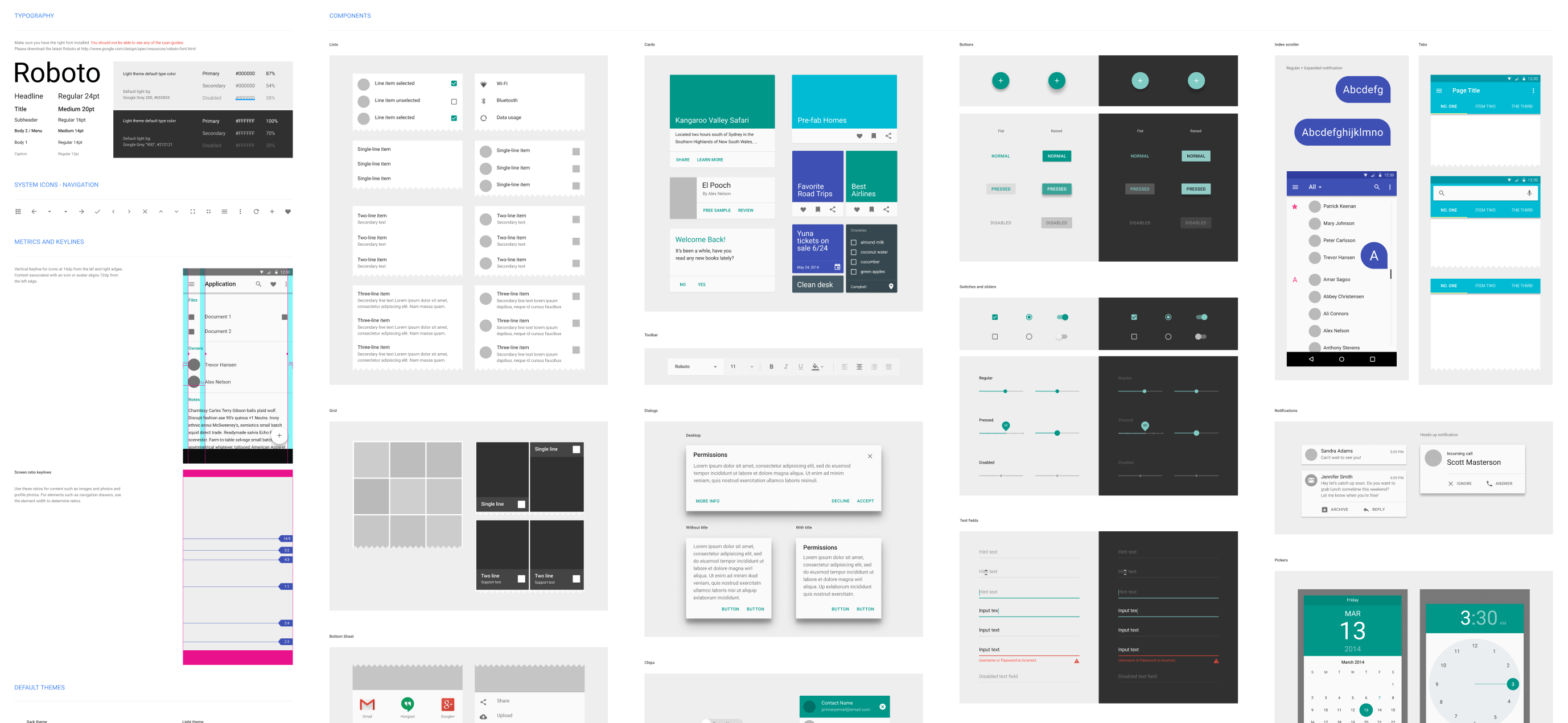
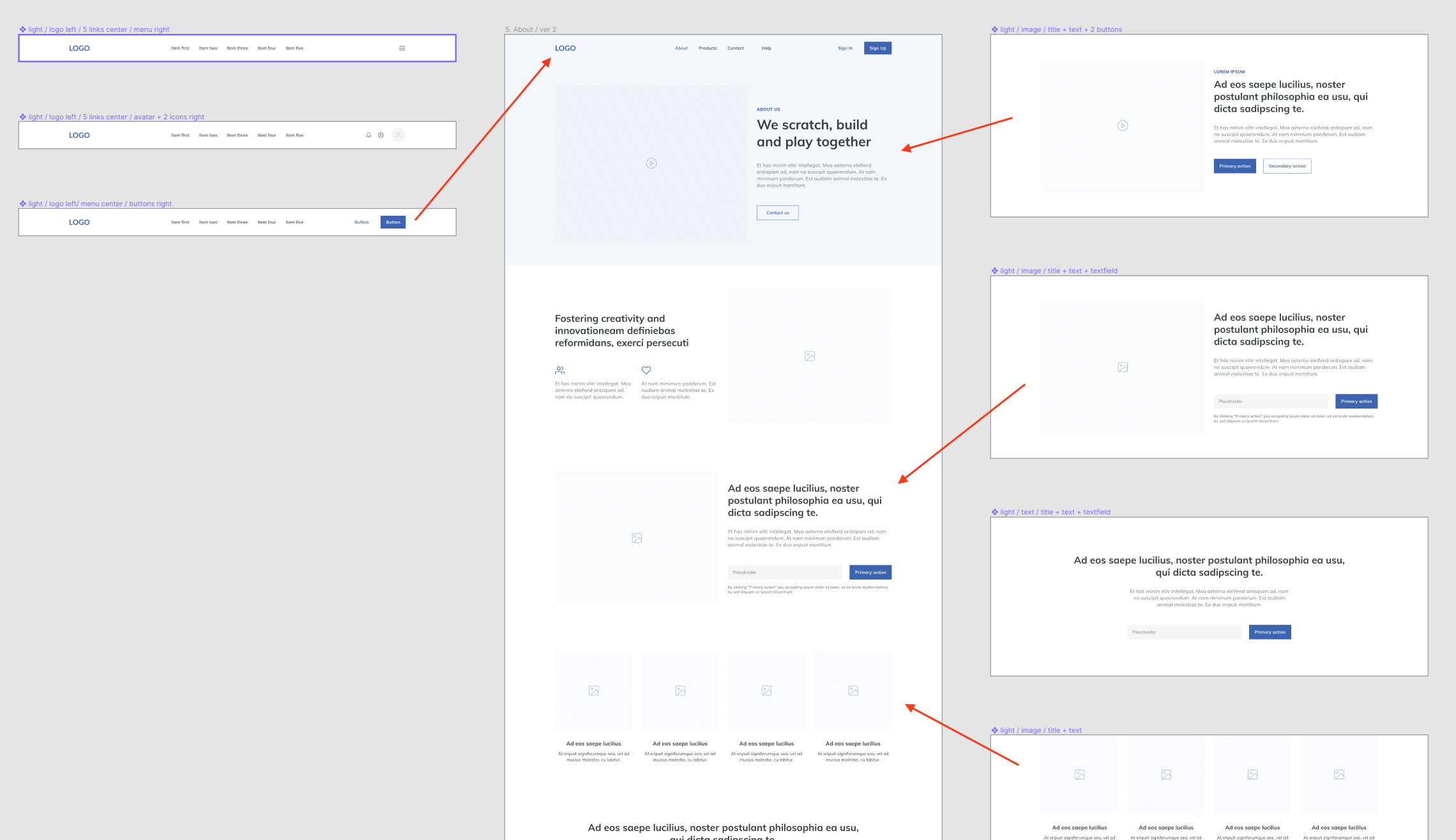
By and large, like a lot of little blocks of things you’ve seen on websites, such as some search boxes, menu layouts, fonts in a variety of weights and sizes, have different names, like pattern library, design language, atomic design.
These will often be displayed in multiple screen layouts: desktop, tablet, phone. Occasionally, there will be a flow illustrated, much like in a flowchart. This will sometimes show a user flow, but will also sometimes allow for a fully animated mock-up, within the app.
Oh yes, plus there’s always buttons—lots and lots of buttons.
What are the benefits of having one?
First and foremost, a design system is about reusability. By breaking an overall design down to its core components, colors, fonts and styles, it allows a designer to build many different designs with just a few items.
Secondly, it ensures consistency. By reducing a whole page down to logo, menu, search block, hero block, content block, call-to-action block, footer, etc., it means that a more generic design system can be reused to build a new design, with the same consistency, but with a modification of the styles to obtain a different look and feel. From a developer’s perspective, that’s referred to as staying DRY, which means, “Don’t repeat yourself.”
This consistency and reusability adds several other major benefits. For example, it saves time and money! The less time it takes to create a new design from scratch, the better. Wireframes for a new design or layout can be developed simply and rapidly, allowing a client to see how a page might work without having to wait for an entire design to be built.
Additionally, it allows for very easy documentation. When a system has been documented once, any new design built from it will mostly work the same way for the developer or the client. Only new elements or new components need to be documented moving forward.
As a developer or a client, how does this help me?
Depending on the tool, it allows for easy collaboration and signoff with clients. Figma, for example, is completely web-based. Because of that, every design built in Figma is shareable, allowing non-designers to view and comment on the wireframe, design, or mock-up. This also helps developers to visualize the designs and easily export a lot of the CSS right from the design itself.
It’s even more useful once a designer integrates user flows and prototyping. A developer will be able to see the expected result in the app before writing any code, ensuring a high level of consistency with the approved templates.
What about WordPress?
Applying a design system specifically to a WordPress-oriented development process is pretty new, so some of this is just conjecture. As I see it, a design system could very much help a team of developers by allowing them to visualize very specific WordPress templates in a new way.
Specifically, the designs could include:
- The components to be included in the header, footer, sidebar
- Components that build each template part, such as:
- Content
- Content archive
- Content page
- Content blocks in the Gutenberg editor, such as:
- Hero
- CTA
- Carousel
- Recent posts
By highlighting the components used in each of these files, it would simplify and speed up the process of building out a new theme.
Which tools are best for developing a design system?
That depends on who you ask. That said, three names are going to be mentioned a lot: Sketch, Figma and Adobe XD. Despite the initial dominance of Sketch in the web visual design space, Adobe XD and Figma have come a long way. All three offer a very similar level of functionality and features.
- Sketch has a free 30-day trial with a $99/year price structure after your trial expires.
- Adobe XD is free with limitations. If you want to use it on more than one project, it’ll cost you $10/month. If you want to use it collaboratively with your team, it’ll cost you $23/user/month.
- Figma is free for two users and three projects. For more functionality, it will be $144/year per user (and up).
Specific recommendations
- Define a grid spacing unit early on, then never ever change it
- Separate each brand’s components into their own library
- Build your blocks separately from mock-ups
- Reuse common elements by taking advantage of symbols/components (each tool calls them something different)
- Start out by sticking to the basics:
- Headers, footers
- Multi-device mock-ups
- Buttons, forms, typography, menus
- Colors, styles, states
- Once the basics are laid out, add the extras:
- Prototyping
- Animations
- User personas
- Flows
I was looking for such technical information since a long time, thanks for sharing valuable information in this article. Keep coming up with posts like this 🙂
Really impressive article it is useful for me upcoming project a lot of good ideas in this article keep more posting thanks.
Really appreciate your efforts..Good work
Your post was very informative and you have explained each point in detail that is beyond helpful. I definitely learned many things and it definitely motivates custom web design services to explore.