404 pages–every website has one, and everyone has landed on one from time to time. The goal is to structure our information architecture and design so that no one ever lands one in the first place, but that’s only in a perfect world, right? We know there are way too many variables out of our control, such as users typing the wrong URL, someone sharing an article but failing to copy the entire website address, etc. The best we can do is make sure that our 404 pages at least offer a good user experience. To start with, let’s learn about creating better 404 pages by looking at what not to do first.
Watch the tone
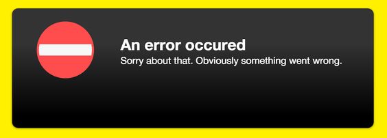
Don’t use negative or condescending language in your 404 message. You may think you’re being witty, but a user with limited time has just landed on the wrong thing and the last thing they want is your sass.
Don’t blame the user
Messages that try to make it sound like the user made the mistake (even if they did) aren’t helpful to anyone. So instead of messages that make assumptions like “Looks like you spelled something wrong,” try using a more positive and helpful approach, with something like, “Looks like we couldn’t find page–try searching again or contact support.”
Don’t give the user information that doesn’t help them
Not much needs to be said here–server error names and codes don’t help the average user.
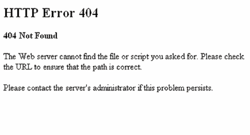
What is the average user going to be able to do with that information?
So now that we know what not to do, let’s look at some positive steps we can take towards a better UX for our 404 pages.
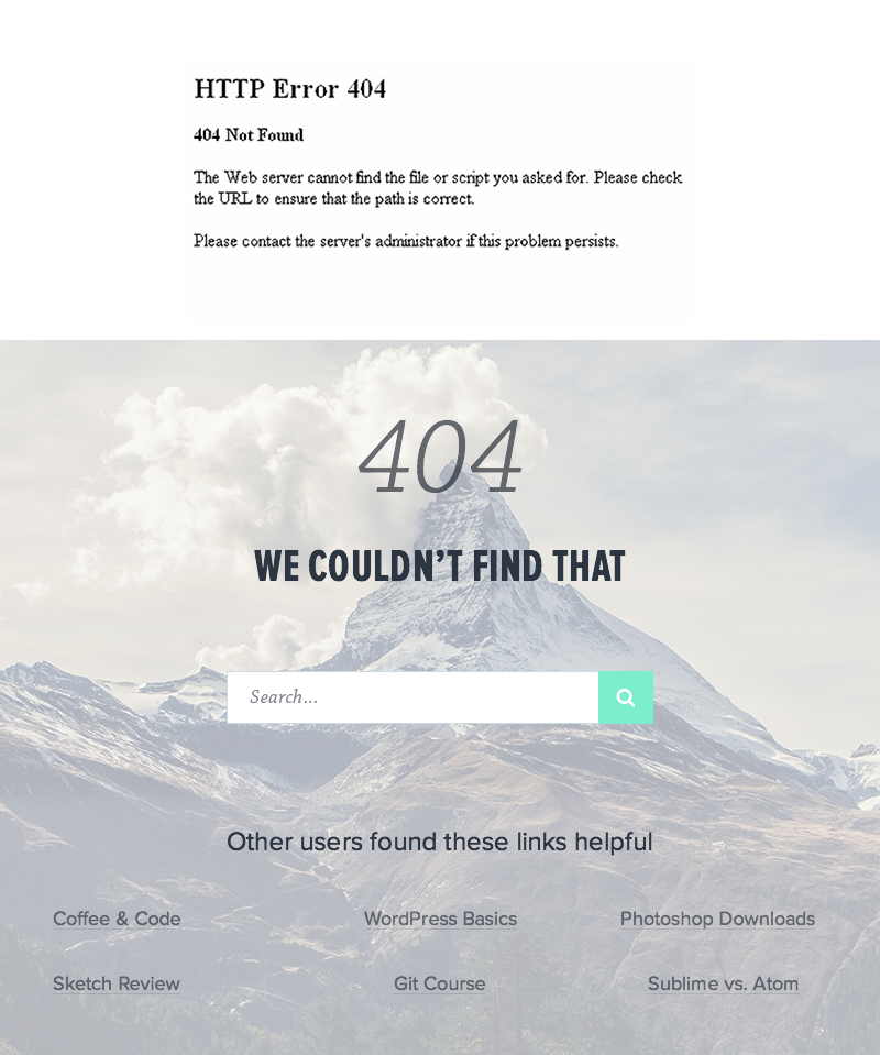
Provide more than just a message
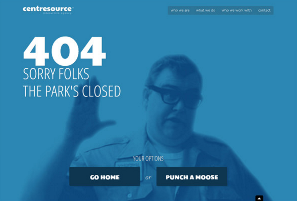
Having good tone and a helpful message is a great start, but what about giving the user some options? We can give the user more options and thus more chances of finding what they were looking for. Try including a search box and some links to helpful or popular pages. Also, don’t forget that there’s no reason you can’t make a 404 page look nice, too! Which of these pages do you think users would rather encounter?
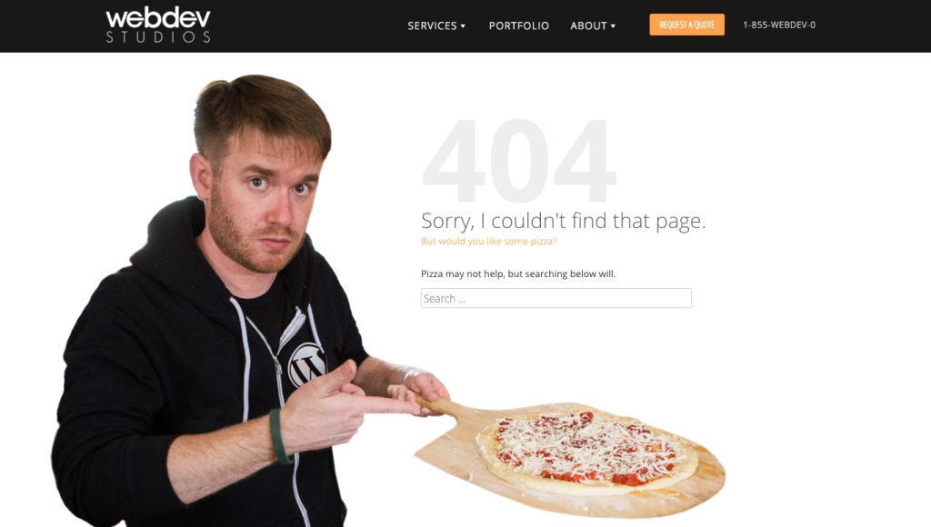
Add a little humor (when appropriate)
Adding a dash of humor to a normally frustrating situation can often be enough to encourage the user to stay on your site and give it another try. Be sure to use your best judgement, though; a humorous 404 message is probably not the best idea for a mortuary website.
Track your 404s
If you’re already using some kind of analytics on your site (as you probably should), why not track your 404 pages? If you notice a lot of people coming to it from another page specifically, that can give you an idea that you need to check that page out as there may be a bad link or some other UX hurdle to address on that page.
Those are my tips for sprucing up your 404 pages! Please let me know if you have any tips I didn’t cover by posting in the comments section below, and hey, what are your favorite 404 pages out there? Link us up!