Last quarter, we were hired by Skype and tasked with building a smaller site, featuring Skype TX. Skype TX is “studio-grade hardware for the broadcast industry, which features peerless integration with Skype.” In other words, Skype Tx is powerful hardware and software for professionals in live broadcast situations.
Because of a hard launch date, this project had a super short timeline and we decided a smaller team would keep us agile. Jaimie would be our Project Manager, Simon would handle the designs/PSD, Damon would deal with the front-end development, and I oversaw the back-end development, as well as serving as a lead for the project as a whole.
I’d like to share our teams experience through building a new website for a pretty well known client.
Designs
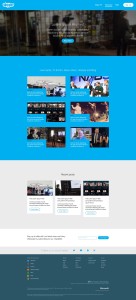 Part of the scope, was a custom design, which featured five different templates. Skype wanted something similar to their current production site, but freshened up a bit for the new product launch. Simon also had brand guidelines and some direction from our point of contact at Skype. I spoke with Simon who told me, “All design research starts with listening. One of the issues Skype had was [that] Skype TX was buried.”
Simon took some time to research the product and find the business value within brand guidelines. This process is called “business proposition.” During the design phase, Simon also had to make the case for a few features.
“Behind good design, there’s a reason for everything. Form follows function since we’re designing not only for the client, but the client’s client…” (AKA the user!)
Thanks to software like Invision, communication between the Simon and the client went smoothly and after a few revisions, both Damon and I had PSDs to work with.
Choosing the theme and plugins
Almost all of our projects include our starter theme, wd_s. This build was no exception! Wd_s enables developers to spin-up a starter themes quickly and develop with modern build tools like Sass and Gulp. We didn’t install too many plugins; we used a select few to manage content via point-and-click, ensure everything had a featured image, rearranging page order, and more. We also used a few custom plugins as well.
The Hero
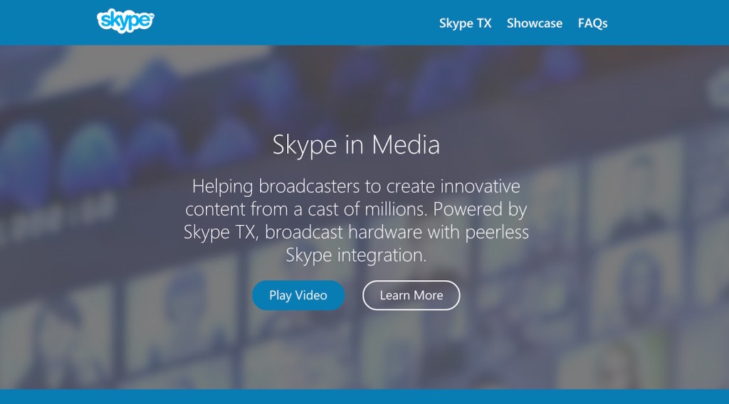
By far the most complicated part of this build was the Hero.
Take a look at the requirements:
- Every post and page must have a hero
- Use post title, excerpt, and featured image as the content, but can add additional content can be added in a control panel
- By adding additional images/content, the hero turns into carousel
- Each carousel slide can have a modal
- Modal must support oEmbeds
- Customizable headline
- Customizable paragraph
- Support for two different buttons, one of which opens a modal
If your head is spinning, don’t worry. So was mine! After speaking with Chris for a bit, we put together a development roadmap and I got to work. Because this hero had to be on every post and page, we decided to use CMB2 to create repeatable group metaboxes. These would serve as the optional “control panel.”
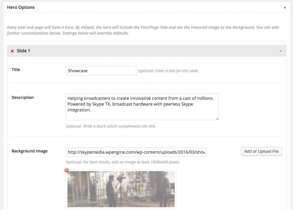
I also used Slick to power the carousel and custom Javascript and CSS to power the modal.
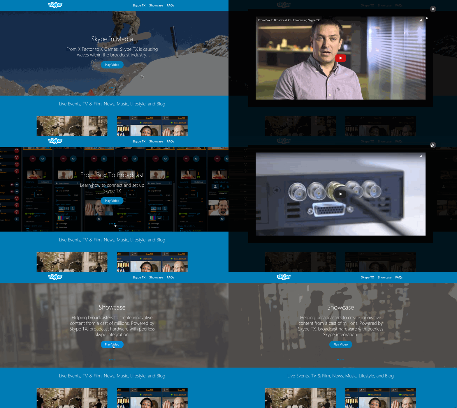
In the end, I really like how the Hero turned out. Some of the functionality developed here, will make its way into our Hero Widget plugin on Github.
The Footer
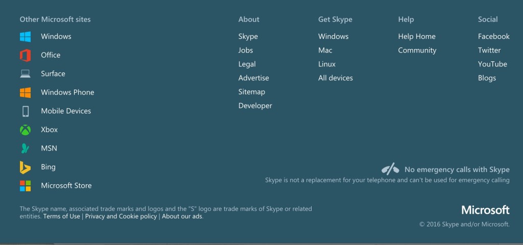
While it may not appear to be complicated, the footer was indeed difficult. Microsoft requires footers on all their web properties to be visually similar. We were instructed to “copy” the footer assets, markup, and functionality from production.
This proved to be a bit of a struggle as Damon describes, “They had some toggling in footer that worked on desktop, but didn’t have a great mobile experience. So we updated the code by rewriting the Javascript around the toggling altogether…”
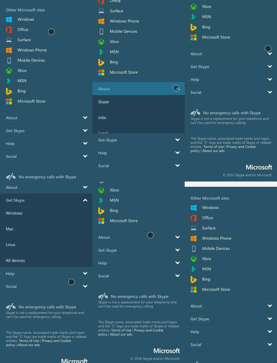
In the end, Damon did a fantastic job creating a footer that works beautifully at any viewport.
Accessibility
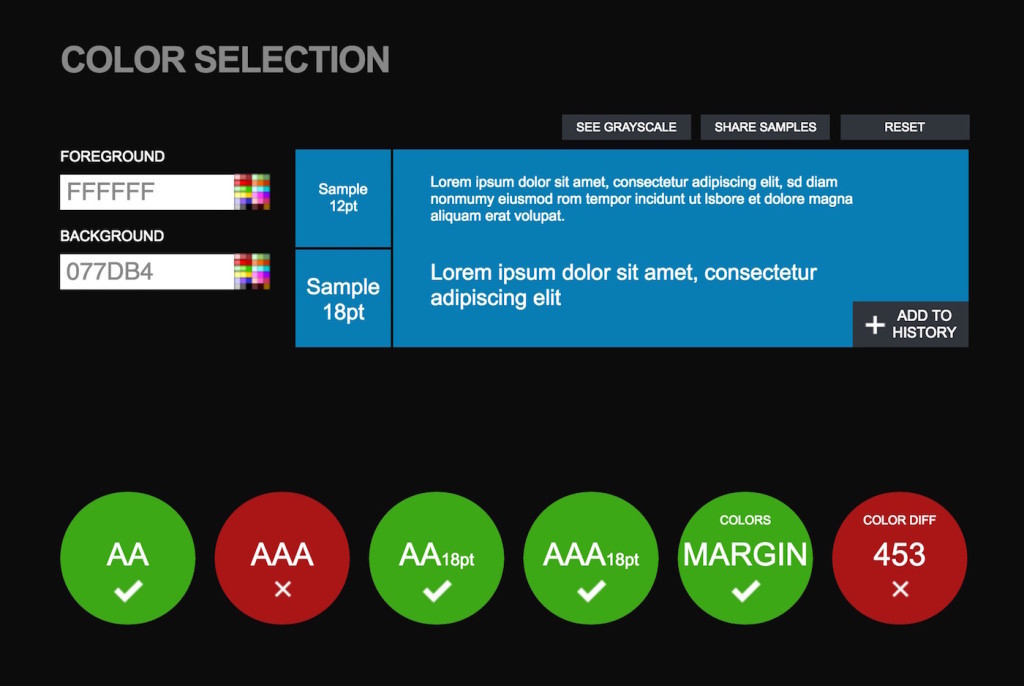
Microsoft takes accessibility very seriously, and this was part of scope from the beginning (as well as a general practice here at WebDevStudios). We had to design and develop to meet WCAG 2.0AA standards. As you can imagine, since Microsoft is such a large company, failure to meet these standards could cost them tens of thousands of dollars in fines. Fines aside, making websites accessible for everyone is just the right thing to do.
We put this site through some rigorous testing to ensure things like, the color contrast and HTML markup passed 2.0AA specs using both Total Validator and ContrastChecker.
Data Migration
Ah yes, the final part of this project was moving the content from their proprietary CMS into WordPress. Normally, this would be handled by our migration team using our custom migration plugin. However given that the site only had about fifty posts, and the time necessary to interface our plugin into that CMS, we instead opted to migrate the data by hand. This process went fairly quickly, and in no time we had all of their content in place.
Hosting
 We’ve been working with Microsoft and their WordPress properties for a couple years, so we’re familiar with the unique challenges and benefits of running WordPress on Azure.
We introduced Microsoft to WPEngine and provided the technical guidance to get Skype in Media on WPE! It’s pretty cool that this project will be the first web property owned by Microsoft on WPEngine!
Conclusion
Even though this was a custom built site for an enterprise level client, we had a short timeline and a few development hurdles. In the end, it was a fun project. I believe we were able to successfully help rebrand Skype TX, and hopefully this will help them sell a few more pieces of hardware–which at the end of the day, is why we’re here.
Nice site.
It’s a good use-case for your CMB2 plugin too. I’ve built quite a few sites which used it in a similar fashion. It sure does save your bacon from having to write a gajillion lines of custom code to make things work 🙂
I love that you admitted to copying the pages over by hand 🙂 I’ve had many instances where I had to convince people that moving them by hand was much quicker than writing a complicated migration script.
Awesome job! And well done landing a job with Microsoft. How did you do it?
I doubt Microsoft lacks the software engineering degrees to pull this sort of thing off. What’s more, I would suspect their IT department probably looks down on WordPress (especially compared to their .NET framework and proprietary software).
So can you comment on why they chose WordPress?
Also, you said you guys wanted to do the job quickly, so you elected to have a smaller team work on it. Normal logic says “many hands makes light work” and the more the quicker. I’d like to hear why you’ve found fewer participants actually makes projects go quicker.
You use Visual Composer? I thought, you are creating a page manually)))
K.I.S.S.
🙂
Visual Composer was used on the landing pages. This allows Skype to drag-drop the layout/features. Blog posts were migrated manually and don’t rely on VC.
Great questions, Mike!
Microsoft does a very good job of measuring their website needs. Across their various websites they have specific business requirements. For the Skype project like they have with all the other projects we’ve been fortunate to work with them on, they researched and tested tools to see which best met those requirements. WordPress is what they moved forward with in this case, and I would say it’s a great choice 🙂
In terms of running a lean team versus more hands in the pot, I think that’s a great question. I also think that more is not always better. We review project requirements and we research/review things like timeline, design and dev requirements, and even hosting requirements. We align those requirements with our resources when making decisions around how to build the project team. The goal is to get to the place where we can most accurately and efficiently approach and complete the project for our clients. We have built a very strong set of processes and a great life cycle to lean on. My take is that adding too many resources on smaller projects introduces too much noise and overlap eventually slowing down the build.
In this specific build we went with a lean and very experienced team. The results speak for themselves.