Over the past few weeks, there has been a lot of work done to the starter theme we use at WDS, known as wd_s. Everything from incorporating a pattern library, migrating our build system from Grunt to Gulp, and adding some really great menu enhancements are just a few that we’ve covered!
Another enhancement we wanted to make was to add a set of base styles directly into the theme for Gravity Forms. I decided to take this task on! Here’s the process I went through to make it happen:
Why a Base Set of Styles?
Applying custom styles to a Gravity Form can turn messy real quick. It can also be very time-consuming if you aren’t familiar with it, because you will be spending the majority of your time trying to figure out what selector to use.
NOTE: I will be referring to Gravity Forms as GF through this post.
Since we use GF on many of our projects, it only seemed logical to set up a simple, not-too-opinionated set of styles that provide a nice starting point for all new projects–something that would cover the most commonly used form fields and provide the ability for extending if necessary.
The Goal
I want this post to be helpful for anyone using Gravity Forms. I may refer to the wd_s theme specifically, but the ideas shared should apply under the context of any theme. I hope to save you time in your Gravity Form styling adventures by detailing a few of the problems I worked to overcome and provide some helpful tips and strategies along the way!
There are quite a few points I want to touch on in this post, so I won’t be focusing so much on the code, but the thinking behind why I went about things a certain way.
I will provide a direct link to the base style file at the end of the post. Please take the time to review it and use it!
Initial Requirements
As I was getting input from my co-workers and getting a game plan together, I put together a few requirements or goals for these base styles:
- Styles should not require any configuration by user–an example of this would be a user having to add class names to fields when creating a form (other than CSS Ready classes).
- Local GF variables should integrate into existing form variables but have the ability to be customized.
- Avoid the use of
!important–this tends to happen a lot when styling GF. - Account for common fields only–the advanced/complex fields can be addressed on a case-by-case basis.
- Sass–keep nesting to a minimal.
Resources
The Gravity Forms documentation is pretty great, but there are two key pieces I thought were most helpful:
- CSS Targeting Examples
Referencing these examples will show you exactly what selectors you need to use to target a specific field type. - CSS Ready Classes
These are classes provided by GF and are used mostly for creating more advanced form layouts such as a form that has two columns. Knowing these classes is important when you want to override the default styles. For example, we will be tweaking the.gf_left_columnand.gf_right_columnclasses a bit later.
Sensible Local Variables
One of the awesome features of Sass is the ability to use variables. Using variables in form styles helps to provide consistency as well as the ability to quickly apply a set of changes!
I would advise against going crazy and creating all kinds of variables. Be deliberate and start out with a select few. You can always add to them later as the need arises.
Here are the variables I chose to target:
//--------------------------------------------------------------
// LOCAL VARIABLES
//-------------------------------------------------------------------

// Form
$gf-padding: 0; // set outer padding on form
$gf-bg: $color-white; // background color of form
$gf-border-width: 0; // border-width on form
$gf-border-color: $color-white; // border color

// Fields / Rows
$gf-field-margin-bottom: rem(25); // margin between field and label below (vertical spacing between rows)

// Labels
$gf-label-font-size: rem(16);
$gf-label-font-color: $color-mineshaft;
$gf-label-font-weight: 700;

// Inputs
$gf-input-color-background: $color-white;
$gf-input-color-border: $color-input-border;
$gf-input-color-text: $color-input-text;
$gf-input-color-focus-text: $color-input-focus-text;
$gf-input-padding: $padding-input;
As you can see, the input variable values are initially tied into the global form variables but can be overwritten if necessary.
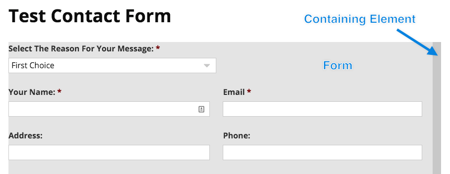
Filling Parent Element
One of my biggest pet peeves about the default GF styles is that the main form wrapper does not fill its parent element. This is especially a problem on forms that are two-columns–and as we know, alignment with the rest of the content is paramount.
Here’s an example of what I mean:
In short, the widths for the form wrapper, columns, and inputs needed to be adjusted in order to achieve the desired result which looks like this:
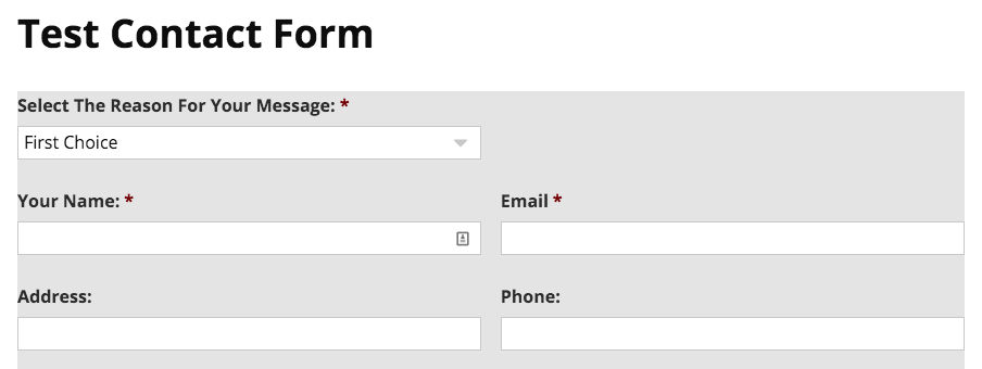
BOOM! Notice how the form extends the full-width of the containing element and the form fields extend the full width of the form itself.
Strategies for Overcoming !important
If you have ever applied custom styles to a Gravity Form, you have undoubtedly had to use !important to override the GF default styles. Don’t worry, I’m right there with you!
In my first pass at coding these base styles, I resorted to using !important fourteen times. Yikes! This was not acceptable and I needed to find a better way to apply these styles that wouldn’t require so many uses of !important.
This is when being able to get input from awesome co-workers is invaluable!
Enter Damon

Damon presented the idea of creating one content specific selector that could be used to house all of the styles that needed to override the GF defaults. The thinking behind this was to just target anything GF form related in this selector that needed higher specificity.
Here is an example of what I mean:
#content .gform_wrapper {
margin-right: 0; // allow for full width of containing element
	max-width: 100%; // allow for full width of containing element

	// Standard fields
	input[type="text"],
	input[type="url"],
	input[type="email"],
	input[type="tel"],
	input[type="number"],
	input[type="password"],
	input[type="file"],
	textarea{
		padding: $gf-input-padding;
		width: 100%;

		@include media($phone-landscape) {
			width: 49%;
		}
	}
}
Using the #content selector makes all selectors in this block more specific than the default GF styles which results in them taking higher priority. As long as the GF style isn’t using an !important, our styles will override!
This was a brilliant idea and allowed for getting rid of all but two uses of !important!
Mobile Styles
As I was working through this task, I quickly realized that just having some default mobile styles in place would be a huge time-saver. At WDS, we typically like our forms to have inputs that have a width of 100% on mobiles and then adjust accordingly as the screen-size grows.
Having these mobile styles built into the default wd_s theme styles is going to save us time and maybe one less headache!
Wrapping Up
In the end, taking on the task of writing these base GF styles was a great learning experience. It really drives home the point of we should always be trying to identify ways to improve our workflow and make ourselves more efficient.
I encourage you to go checkout the full code on Github. Please leave your questions, comments, or suggestions below! I want to hear from you.
Would it not be easier to disable gf css completely and start from scratch?
I have question regarding gf styling as other framework (bootstrap materialize ect have their own input label form is it possible to make just so it uses the page-slug template and sends it to the form we need while the form is hand coded instead of generated?
Can you guys please create a plugin? I currently do all my tech myself, and have limited knowledge of CSS. The idea of having to code all this, basically from scratch, is completely overwhelming to me. But GF are inherently ugly, and none of the “beautiful optin box” plugins play well with GF. It would be fabulous if someone would create a plugin to let the user adjust the form CSS by selecting things like colors, widths, etc. from a UI.
I’m so frustrated by having to choose between ugly forms with decent functionality, and beautiful forms that don’t do squat. 😛
Rachel: I can certainly agree with you that trying to style a Gravity Form can be quite a daunting task. This was the main reason why we decided to get a set of base styles put into place.
In regards to creating a plugin, this is an idea I could discuss with our team to see what kind of options we might have!
Is there a tutorial on styling the output of Gravity Forms? I have a form that, when submitted will go directly to my printer, but the standard blue/white lines are not only ugly, but WAAAAAY inefficient. The form data fills page after page, but could fit on roughly one single page in a clean manner. If there is a guide to help me out I would appreciate a little direction. Thanks for the great information!
Printing out the form in a friendly manner is more the job of the theme rather than Gravity forms. After a quick search, I found this link that might be helpful – https://www.gravityhelp.com/forums/topic/print-preview.
I hope this helps!
Did webdev studios ever make any plugin?
Hi, Todd. Thanks for asking. I work with Eric at WDS and I’ll be responding on his behalf. At this time, we have no plans to develop such a plugin. And new plugins that we do release are launched at Pluginize. Thank you for visiting our blog and commenting.
You can also try our plugin Form Styler Ultimate.
With it, you can completely customize the look & feel of any form on your WordPress website (inluding Contact Form 7, Gravity Form and Ninja Form).
Form Styler Ultimate lets you add easily style forms on your WordPress site. It has tons of features that gives absolute control on the appearance of your forms.
Tested and compatible with some of the famous themeforest themes, like Avada, Betheme, X Theme, Enfold, The7, Bridge as well as WordPress default themes, like Twenty Fifteen.
You can see a live demo with a ton of examples at our live demo page.
Thank you