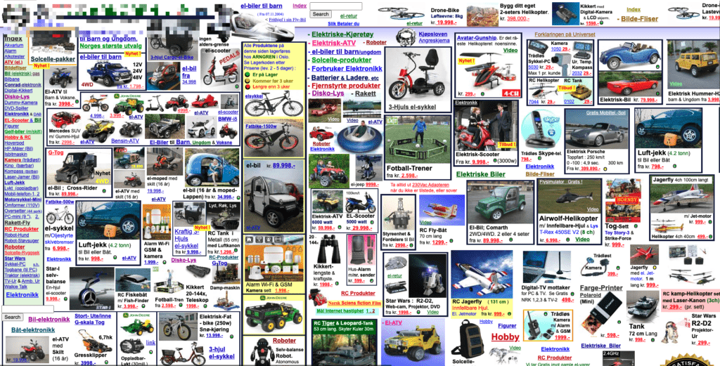
If your website looks like the one above you either have really, really, really particular brand following… or it might be time for a website redesign.
There is never a perfect checklist or milestone your website needs to meet in order to justify a redesign. It varies from person to person and even site to site. In this blog post, I’ll cover some of the most common reasons that I’ve experienced first-hand from over ten years in the web design space.
While your website may not check all the issues, I hope to make it broad enough to equip you with enough evidence to convince your stakeholders (even if it’s yourself) that you are due for a makeover.
For content breakdown, I’ve split reasons for change into the following buckets:
- Obviously scary warning signs
- Increase in traffic
- Being compliant with laws
Preface: A redesign doesn’t have to be scary.

To start off it’s okay to feel overwhelmed or perhaps scared to redo your website. This can be due to limits on your time, fear from past site rebuilds that went south, or perhaps you simply fear losing your content. The following list of concerns isn’t exhaustive but it serves to say that we understand why you may be hesitant.
Throughout the rest of the article, I help to demystify some of your concerns and offer some, hopefully, compelling examples that may convince you that the time for change is now.
Limits of Your Time
This is the easy part. Simply by partnering up with a website company that already has established relationships in place, you can count on them to handle the strategy planning and take it from there. If you don’t already have a WordPress agency in mind, I highly recommend us at WebDevStudios. If your business is on the small to medium side, a website redesign from Maintainn, which is owned by WebDevStudios, will be a perfect fit.
Being burnt in the past
In my ten-plus years of web development experience, I’ve heard countless horror stories of projects going wrong. Though you can’t control everything, joining forces with the right design and development partner with a proven track record should help to put to ease your concerns. Don’t allow the past to deter you from creating a successful future.
Fear of losing your content
Unlike other platforms in the past, WordPress is what is known as a content management system, not just simply a website builder. The way your website looks and feels is handled through themes on your website. This is the part you are redesigning, not your content. Think about it like this: if your website content is an engine in your car, you can swap the body and still keep the same engine. All your pictures, posts, products, and more will migrate just fine. (Whew!)
Bucket One: Scarily Obvious Signs

It’s difficult to make content updates.
If you can’t update your website, what good is it for? As a content management system, WordPress should make editing your website be as easy as riding a bike. Something to consider is that if you have an older WordPress installation, major advancements have been made towards how you can design and manage your website, be it Gutenberg for custom websites or Beaver Builder for smaller businesses. A newly redesigned website will provide you with the latest tools to allow you to feel empowered to make content updates when YOU want.
It just doesn’t express who you and your company are anymore.
Let’s face it: many of the fashion trends from the early 1990s don’t look so great in the 2020s. Saying your website doesn’t express who you are today doesn’t admit that your old website was bad when it came out; it’s just time to update your digital wardrobe.
Other Scarily Obvious Reasons
- You have a new product line.
- You have a new company direction.
- It looks like an amateur made it.
- It takes a long time to load.
- It’s difficult to use.
- The words “flash is required” are anywhere on your website.
- It lacks a friendly mobile experience.
- It’s lacking key features, like the presence of social media integrations.
Bucket Two: Increase Traffic and Conversion

If your website was on Tinder, would visitors be swiping left?
– Laura Coronado, WebDevStudios Marketing Strategist
More traffic = More Customers = More Sales = More $$$
The golden rule of a website’s value, from a business perspective (even if you are a nonprofit), is more traffic means more users served. There are a countless number of ways to drive more traffic to your website, be it SEO, ad campaigns, guerrilla warfare, or a magic ritual. One thing for certain, an outdated and poorly designed website will impact how much money you make at the end of the day.
How Design Affects Traffic
Did you know that your site’s design can make an impact on your SEO and thus affect your traffic? Since 2015, mobile-friendliness has been among the many factors that Google uses when it ranks websites in search results. Another design element that affects your search ranking is your site’s load speed, while this can be influenced by your site’s hosting. Also, a poorly designed website that uses unnecessarily large graphics can cause people to abandon your website in as little as two seconds! To read more on this topic, check out “5 Ways SEO & Web Design Go Together” by Search Engine Journal.
How Design Affects Conversion
The internet has matured past the point of anything truly being first to market for any standard consumer goods or services. With that, your average customer is savvy and aware that if they don’t like what you are offering, they’ll just go somewhere else. To keep visitors browsing and ultimately converting them to paying customers, your design needs to create a pleasant user experience by making content easy to find and visually pleasing. It’s not just the product or service your site is offering. It equally matters as much how you are offering it.
Bucket Three: The Law Forces Me to
 If you aren’t convinced by now that you may need a new website. perhaps civil law may convince you. For the better part of 35-plus years, laws dictating how websites are to be designed and behave were mostly absent at any large scale. This is no longer where we are today. You know you need a website redesign when compliance with the law dictates it.
Accessibility
I recently wrote a blog post titled, “5 Ways to Make Your WordPress Site More Accessible.” In it, I covered not only tips to better deliver your content but also legal and monetary considerations you should be aware of if you are ignoring accessibility in your website’s design.
Since 2017, accessibility lawsuits related to website accessibility, which is directly impacted by your website’s design, have doubled every year with as many as 3200-plus in 2019 alone. I highly recommend you give my article a read, but in summary, by not coming into compliance with good site design, you could leave yourself liable for punitive damages.
Cookie Compliance
Even if you have a nice-looking website that meets your needs and is accessible to others, that still may not be enough. Starting October 1, 2020, any website that has European Union (EU) consumers needs to conform to enhanced cookie compliance laws. It’s quite common for third-party themes to include third-party tracking cookies that are not compliant with EU regulations. Any redesign should take this into consideration what tools and resources are used in your website’s build.
The End

Whether the need for a website redesign is obvious, stems from a desire to boost traffic and sales, or compelled by legal reasons, I hope you found this post informative. Just remember that with the right partner, a redesign doesn’t have to be so scary! If you’re ready to get started, reach out to us at WebDevStudios, or for smaller businesses, contact Maintainn.