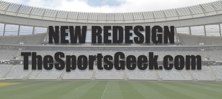
WebDevStudios is thrilled to announce the launch of the new and improved TheSportsGeek.com! Working with Kevin McClelland, editor of The Sports Geek, was exciting. The challenge that he presented included the requests for a fresh redesign, a logo refresh, and a full-site-rebuild on WordPress. The original website was somewhat outdated, text-heavy, and in need of some visual pizzazz to better represent the energy of the client.
Admittedly, I’m not much of a sports guy, but that doesn’t prevent me from designing a great experience while concentrating on the important part: the content. We needed a plan focused on engagement and energy, while retaining the “sports” feel, so as to not alienate current users.

The Process
The first thing you might notice about the old site is that it’s plain; there is a lot of white and red. The header takes up the majority of “the fold,” and the site wasn’t mobile-responsive or mobile-friendly—a design that hearkened back to the early aughts.
“With the world switching to viewing websites on mobile devices, I knew I needed an updated and responsive website, but I was hesitant on getting a new website designed,” explains Kevin. “I thought the process would be confusing and difficult for someone like me who doesn’t have a background in design or coding. Thankfully the WebDevStudios team made the process very easy.”
Kevin came to the design with inspiration drawn from various sports, sports news, and sports betting sites like CBS Sports and Fantasy Pros. Three things they all had in common was that they were content robust, generally monotone, and very modular. So I started there and extrapolated.
“Every step of the way was carefully planned out, and there was an entire team working together to ensure I was happy with all aspects of the website,” Kevin says. “Communication was top notch throughout with weekly calls to keep me updated, and any of my questions or inquiries answered very quickly.”
The Layout
The typical user wasn’t spending much time on the site. Once signed up, users had the opportunity to receive emails with a bulk of fresh content. So, the primary goal was clear that user retention was important, but more so, user acquisition. The majority of the content on the old site was being served up long form without much imagery or differentiation in content. I needed ways to break things up. Enter the card.
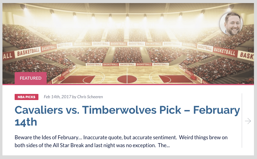
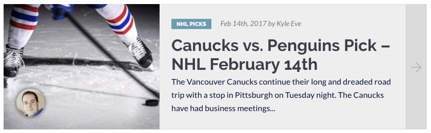
A simple but effective way to break up content throughout the site, this layout solution comes in two forms: a “feature” visible on most pages and a general-purpose “card” visible everywhere else. Even the widgets are compartmentalized to keep things separate, but together.
Every part of this site was designed to create a hierarchy and separation between content; thus, influencing user focus, something that was sorely lacking in the old site’s layout.
The Colors
Red plays only a minor role in the new site design. Instead, blue and yellow take center stage, which are colors commonly used in the sports world.
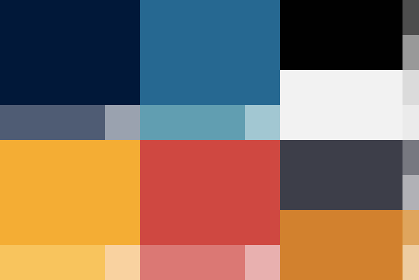
I needed to keep things calm (blue) while bringing focus to elements throughout the site (yellow). Success!
The Header
The old site’s header, video, call to action, and a button is persistent on all pages, which is fine, but taking up that much real estate on a page can be problematic, especially on mobile devices.
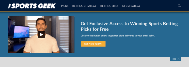

Here, I’ve decreased that space requirement, while also giving users the ability to hide this block (not entirely) to clean things up a bit. Though the magic of javascript and cookies, that state (open or closed) is saved for the user; so, they do not constantly have to open or close that header block. Ahh, the internet… What can’t it do?
The Logo
The logo took shape after the site was well into the design phase, which is a fun little design challenge. We were left with a very specific space to fill in the header (longer than it was tall), a limited color palette given the darker blue background, and the need to somewhat refer to the original logo of the old site.
I kept things angular and in the vein of the old logo, but with a little extra flare, grabbing inspiration from existing sports logos, news sites, and for good measure some tech sites (for the geek).
![]()
The final logo design came out of our fifth choice, after a few minor tweak and solidifying the type… Voilà!
“When it was time to launch the website, I was eager to see what my followers/fans thought of the new design,” Kevin shares with us. “Within just a few hours of going live, I had numerous emails and tweets from people letting me know how much they loved the re-design; and since then, I’ve still had nothing but positive comments.”
Conclusion
Given several, albeit minor restrictions, we were able to give The Sports Geek a fantastic new look and feel without ignoring its roots. We’ve organized the content and provided a better mobile experience for those catching up on the fly. If at the end of the day, site traffic and new-user acquisition has improved by even a fraction, we’ve done our job. And that’s the power of design.